An architecture diagram is a visual representation of a building’s organisation, systems, or relationships. Unlike a plan or section, which shows geometry, a diagram shows ideas. Diagrams are abstract, simplified, and analytical. They answer questions like: how does light enter? How do people move? How are spaces related? Where does the structure go?
These 12 architecture diagram ideas span programmatic organisation, circulation, structure, environment, and site analysis. Each idea includes defining characteristics, design principles, and applications.
1. The Program Distribution Diagram
The program distribution diagram shows how functions are distributed across the building. Different colours or shadings represent different programs: public (red), private (blue), service (green). The diagram can be a plan, section, or axonometric.
This diagram answers: where are the public spaces? Where are the private spaces? The emotional effect is colourful, legible, and programmatically clear.
Quick Tips
- Use no more than three to four program categories.
- Colour-code consistently across all diagrams.
- A legend is essential.
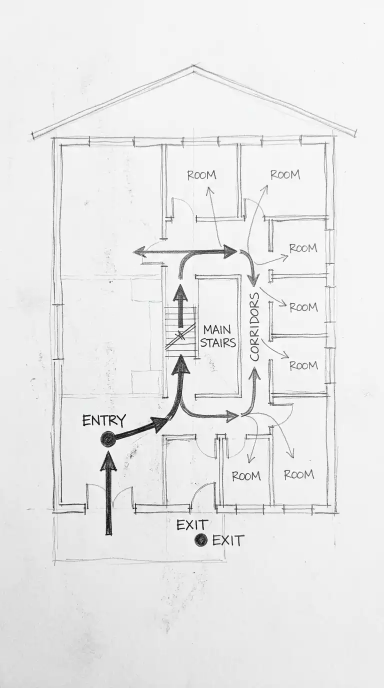
2. The Circulation Diagram
The circulation diagram shows paths of movement through the building. Arrows indicate direction. Line thickness indicates traffic volume. Nodes (circles) indicate intersections or destinations. The building itself is shown as a faint outline.
This diagram answers: how do people enter, move through, and exit the building? The emotional effect is dynamic, directional, and flow-oriented.
Quick Tips
- Use arrows, not lines — circulation has direction.
- Arrow thickness should match expected traffic volume.
- Show entry and exit points clearly.
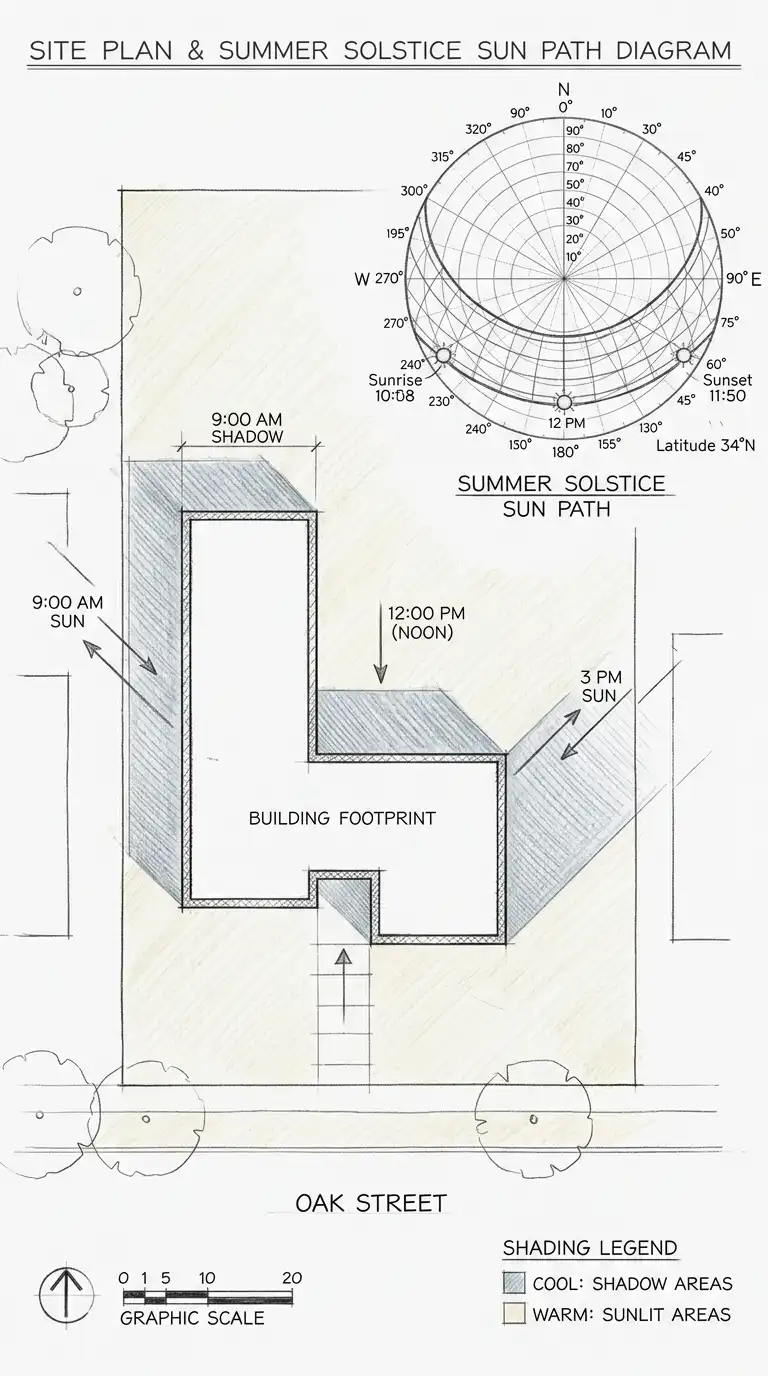
3. The Sun Path Diagram
The sun path diagram shows how sunlight moves across the site and building. The diagram includes a sun path for the site’s latitude, showing sun angles at different times of year. Shadows are drawn for key times (9am, 12pm, 3pm) on the summer and winter solstices.
This diagram answers: which facades get morning sun? Which get afternoon sun? Where will there be shade? The emotional effect is analytical, climatic, and environmentally intelligent.
Quick Tips
- Use a standard sun path diagram for the site latitude.
- Draw shadows accurately based on building height and sun angle.
- Colour-code: warm colours for sun, cool colours for shade.
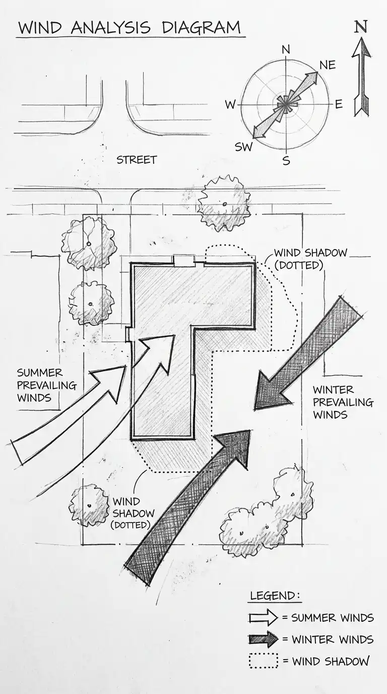
4. The Wind Diagram
The wind diagram shows prevailing wind directions and wind shadows. The diagram includes arrows for summer and winter prevailing winds. Wind shadows (areas protected from wind) are marked behind buildings or landforms.
This diagram answers: where will wind be strongest? Where will it be calm? The emotional effect is environmental, climatic, and site-responsive.
Quick Tips
- Distinguish summer and winter winds with different arrow styles.
- Show wind shadows as dotted outlines behind buildings.
- Use a north arrow and wind rose.
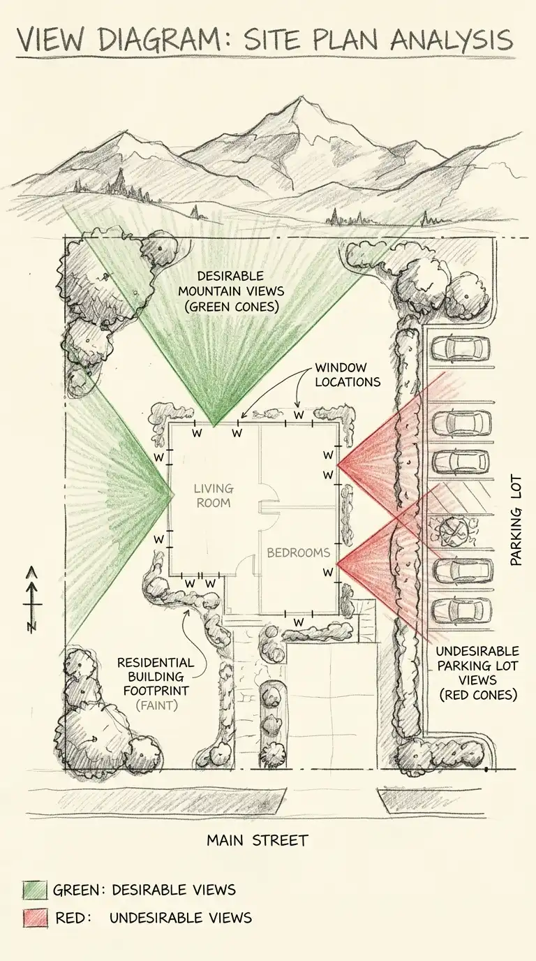
5. The View Diagram
The view diagram shows desirable and undesirable views from the site. View cones are drawn from key points (entrance, living room, terrace). Desirable views (mountains, water, city skyline) are marked with green shading. Undesirable views (parking lot, highway, industrial area) are marked with red shading.
This diagram answers: what will people see from each space? The emotional effect is visual, site-responsive, and experiential.
Quick Tips
- Draw view cones from windows, terraces, and entrances.
- Use green for desirable views, red for undesirable.
- The building footprint should be faint.
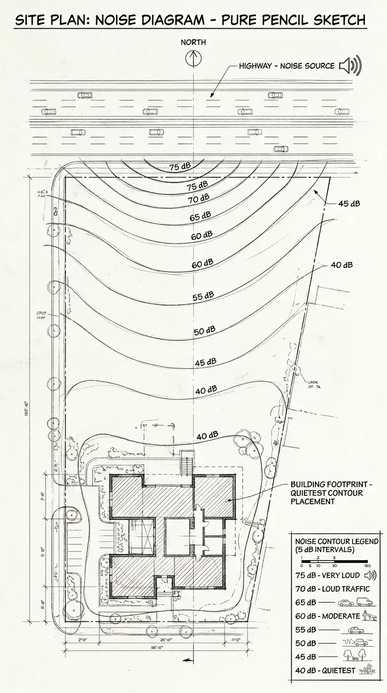
6. The Noise Diagram
The noise diagram shows noise sources and their impact on the site. Noise contours are drawn like topographic contours, showing areas of different decibel levels. Quiet spaces (bedrooms, libraries) are placed in the quietest areas. Noisy spaces (garage, mechanical) are placed near noise sources.
This diagram answers: where is the site quiet? Where is it loud? The emotional effect is acoustic, analytical, and privacy-oriented.
Quick Tips
- Draw noise sources (roads, railways, airports) on the diagram.
- Draw noise contours at 5-decibel intervals.
- Quiet spaces should be in the quietest contours.
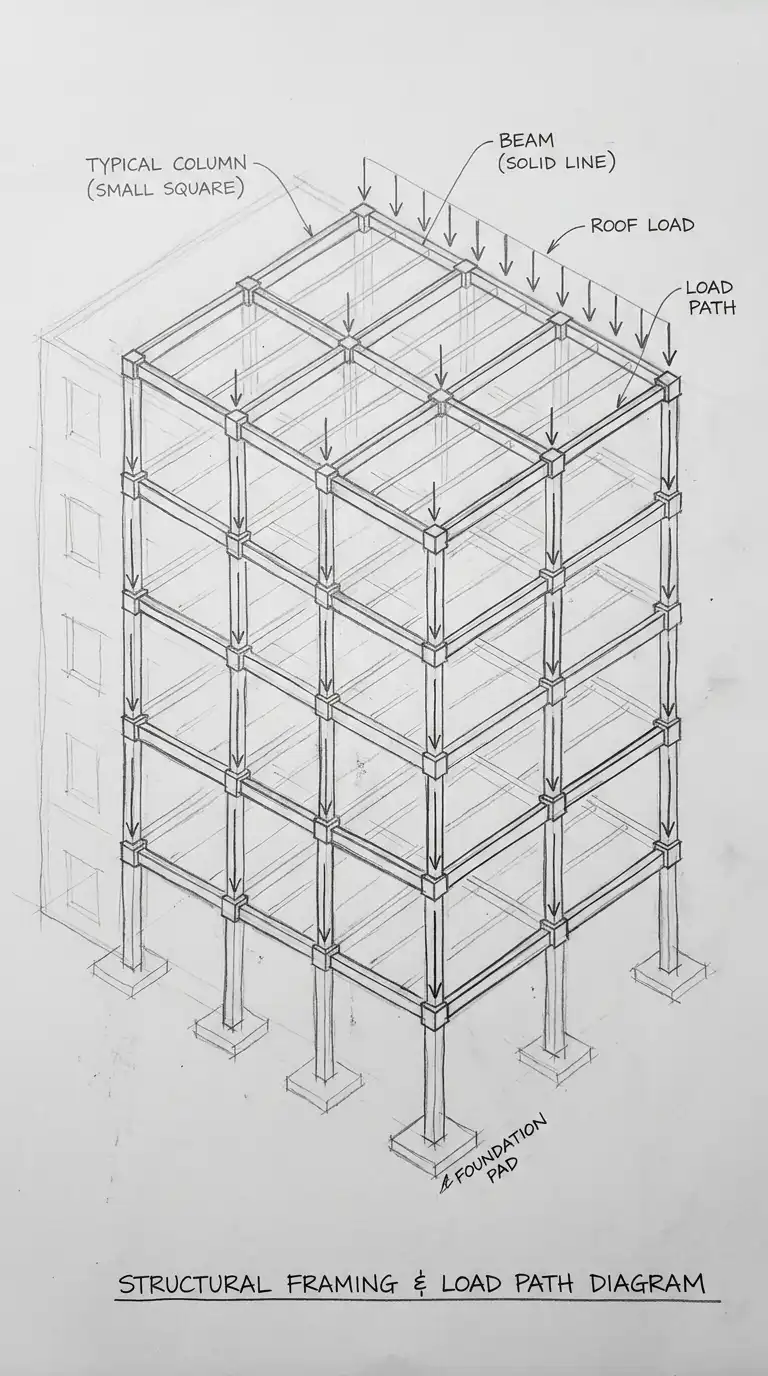
7. The Structural Diagram
The structural diagram shows the building’s structural system. Columns are shown as dots or small squares. Beams are shown as lines connecting columns. Load paths are shown as arrows. The diagram is simplified — no dimensions, no connections, only the structural logic.
This diagram answers: how does the building stand up? The emotional effect is structural, logical, and clear.
Quick Tips
- Show columns at their centres, not their outer dimensions.
- Use dashed lines for beams hidden above or below.
- Load arrows should show force path from roof to foundation.
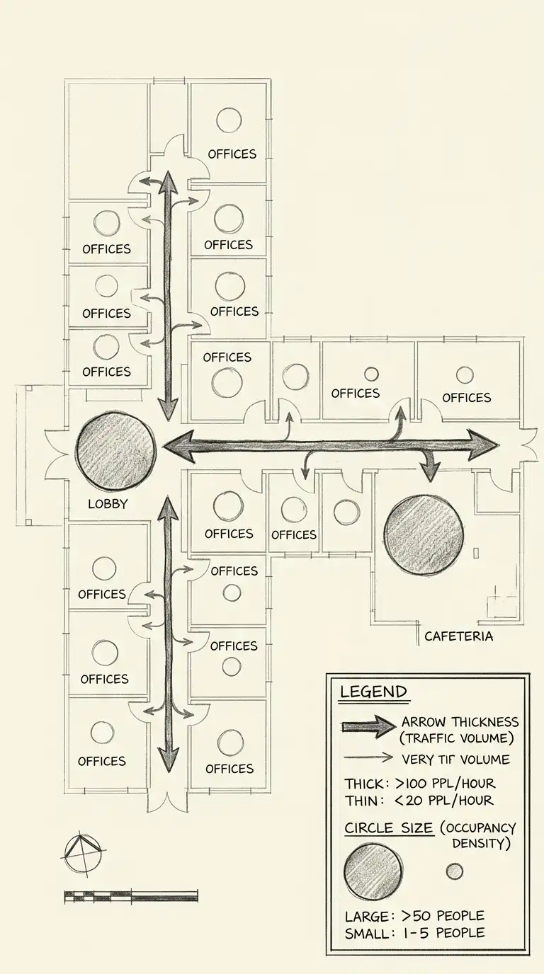
8. The Circulation Density Diagram
The circulation density diagram adds quantitative information to circulation. Arrow thickness represents the number of people moving along each path. Circle size represents the number of people in each space. The diagram is a heat map of movement.
This diagram answers: where are the crowds? Where are the quiet spaces? The emotional effect is quantitative, flow-oriented, and programmatically dense.
Quick Tips
- Arrow thickness = expected traffic volume (people per hour).
- Circle size = expected occupancy (number of people).
- Include a legend explaining thicknesses and sizes.
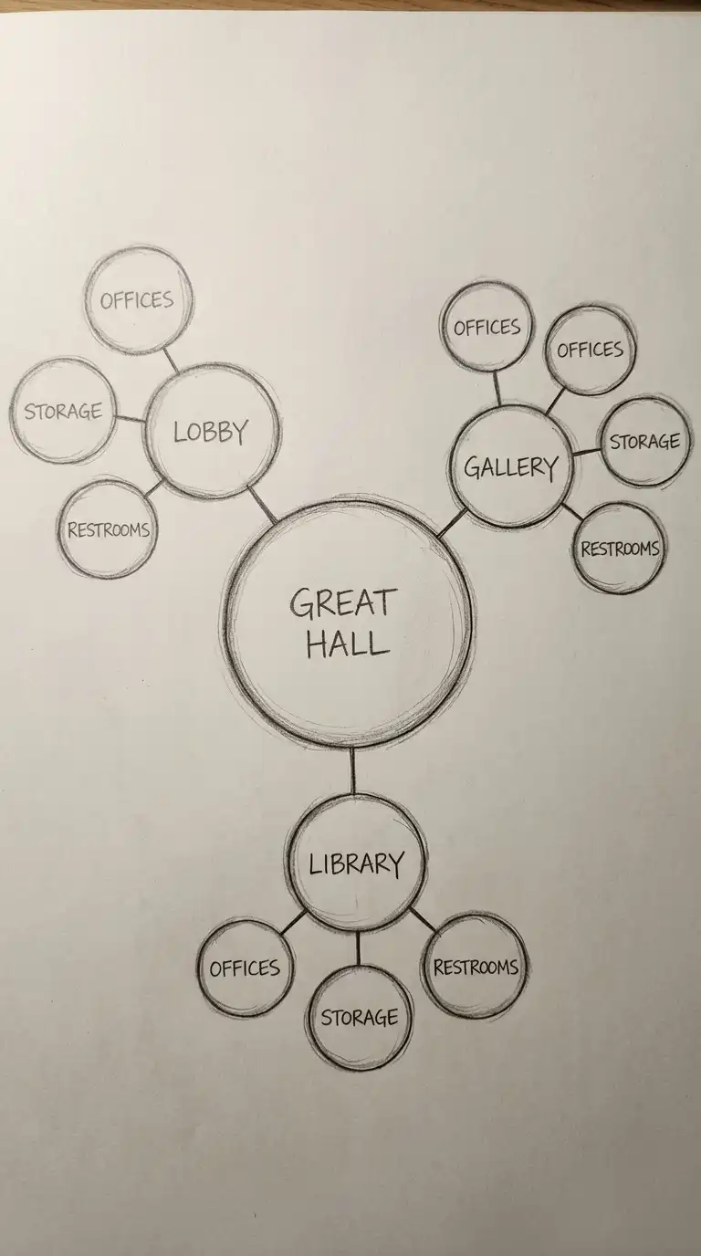
9. The Spatial Hierarchy Diagram
The spatial hierarchy diagram shows the relative importance of spaces. The most important space (the “heart” of the building) is the largest circle. Secondary spaces are smaller circles arranged around it. Tertiary spaces are the smallest, attached to secondary spaces.
This diagram answers: which space is most important? How do other spaces relate to it? The emotional effect is hierarchical, centralised, and clear.
Quick Tips
- The most important space should be the largest circle at the centre.
- Secondary spaces should be smaller circles around the centre.
- Tertiary spaces should be the smallest, attached to secondary spaces.
10. The Parti Diagram
The parti diagram is the simplest and most abstract architectural diagram. It captures the big idea of the building in a few lines and shapes. A parti might be a line (the building as a wall), a circle (the building as a gathering place), or a grid (the building as order). The parti diagram has no labels, no dimensions, no context — only the idea.
This diagram answers: what is the single organising idea of the building? The emotional effect is abstract, essential, and conceptual.
Quick Tips
- Use no more than three shapes or lines.
- No labels, no dimensions, no context.
- The diagram should be understandable without text.

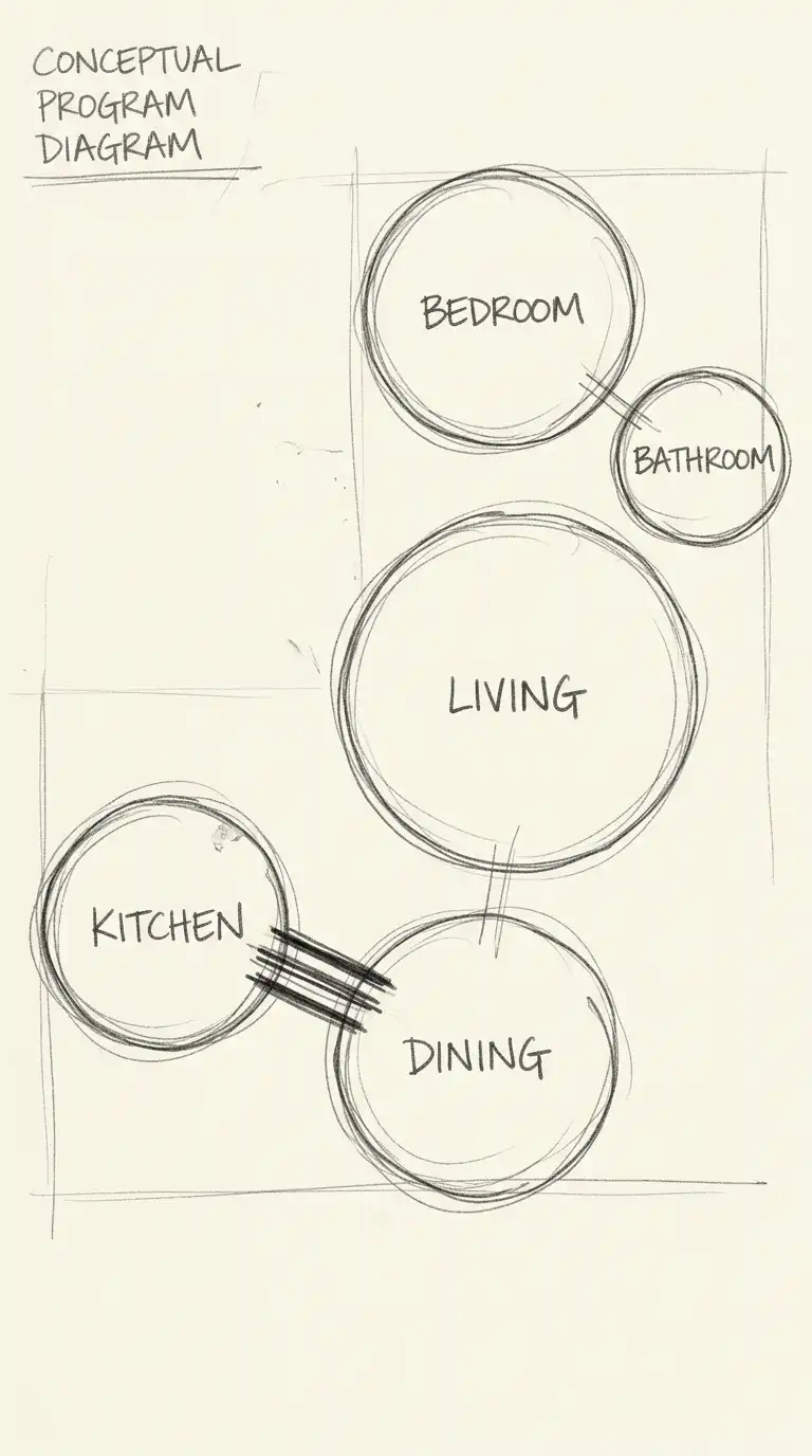
11. The Program Bubble Diagram
The program bubble diagram uses bubbles to represent rooms or functions. The size of the bubble represents the size of the room. Lines connect bubbles that need to be adjacent. Line thickness represents the strength of the adjacency required.
This diagram is the first step from program to plan. It answers: what spaces need to be near each other? The emotional effect is logical, clear, and programmatically intelligent.
Quick Tips
- Bubble size should be proportional to room area.
- Line thickness should indicate adjacency importance.
- No geometry — bubbles should be abstract.
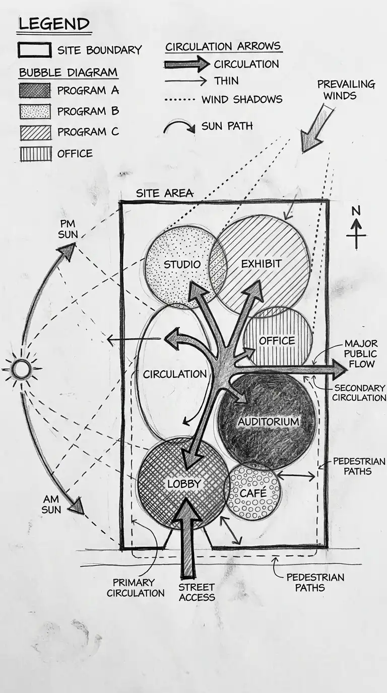
12. The Hybrid Diagram
The hybrid diagram combines multiple diagram types on one sheet. Program, circulation, structure, and environment are all shown in a single, dense diagram. Different shading, line types, and symbols distinguish the different types of information.
This diagram answers: how do all these factors interact? The emotional effect is dense, complex, and synthesised.
Quick Tips
- Use a consistent shading and line code for different information types.
- Include a legend explaining every symbol.
- Keep the diagram readable — do not overload it.
Final Thoughts
An architecture diagram is not a drawing. A drawing shows what a building looks like. A diagram shows how a building works. The best diagrams are simple, clear, and abstract. They leave out details to focus on relationships.
These 12 diagram types are not mutually exclusive. A hybrid diagram can combine program, circulation, and environment. A circulation diagram can include density information. A program bubble diagram can be arranged by privacy gradient. The best diagrams are not the most detailed — they are the most informative. They answer the questions that matter before a single wall is drawn.