An architecture poster is a visual statement. It can announce an exhibition, promote a lecture, present a student project, or simply celebrate a building. Unlike a technical drawing or a portfolio page, a poster demands attention from across a room. It must be bold, clear, and memorable.
These 15 architecture poster ideas span typographic compositions, abstract diagrams, photographic essays, and hybrid techniques. Each idea includes defining characteristics, design principles, and applications for architectural communication.
1. The Typographic Blueprint Poster
The typographic blueprint poster uses only text, lines, and minimal geometric shapes to evoke architectural drawings. No photographs, no renderings. The composition is built from typography: building names, addresses, dates, architects, construction materials, and quotations.
The aesthetic is technical and restrained. White or yellow text on a deep blue background mimics architectural blueprints. The emotional effect is precise, intellectual, and quietly dramatic.
Quick Tips
- Use a monospaced or technical sans-serif font: Helvetica, Univers, or DIN.
- Create hierarchy with font size, weight, and tracking, not colour.
- Include a title block in the lower right corner like a real blueprint.
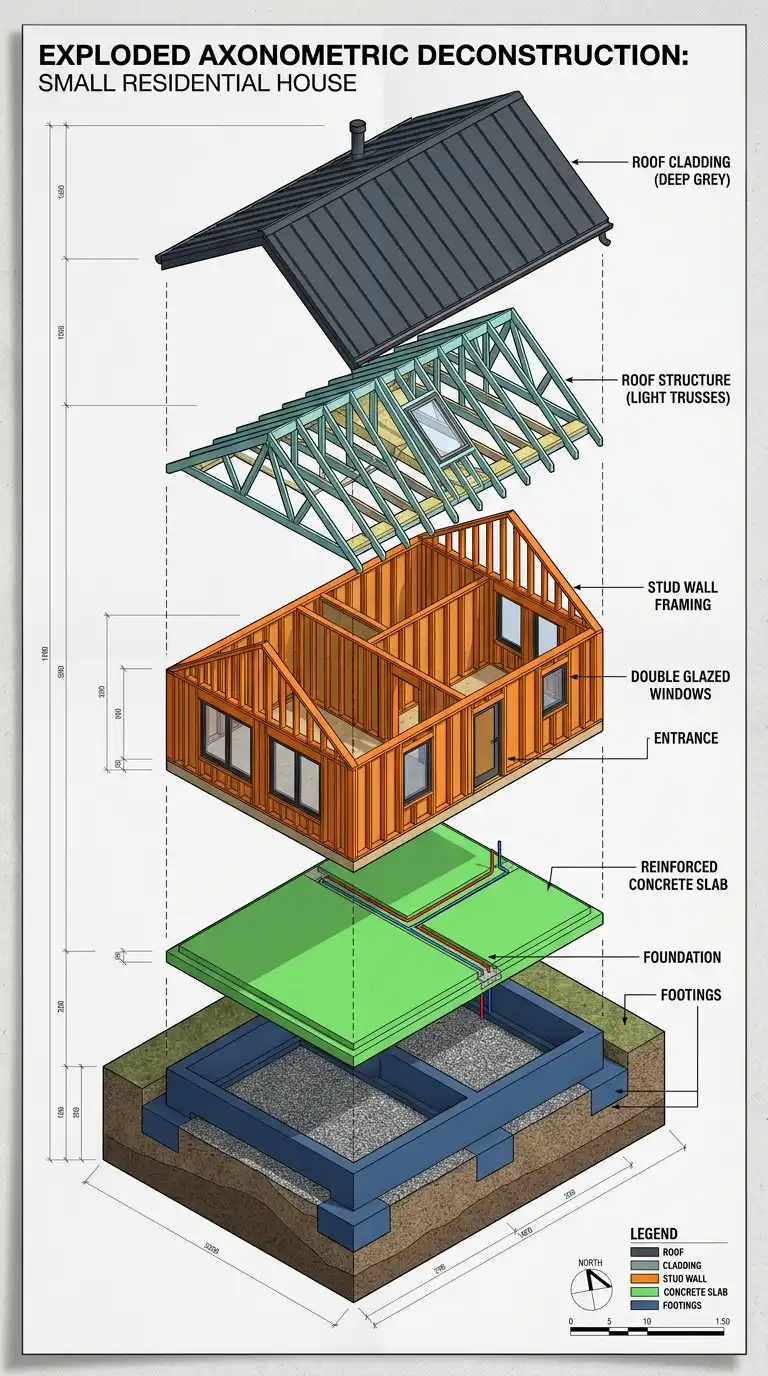
2. The Exploded Axonometric Poster
The exploded axonometric poster shows a building taken apart layer by layer. Floors, walls, roof, and structure float apart along a vertical or diagonal axis. The drawing is large, occupying most of the poster surface.
This poster type demonstrates construction logic and spatial organisation. Colour can distinguish layers or systems. The emotional effect is technical, dramatic, and highly legible.
Quick Tips
- The explosion direction must be consistent — vertical is most readable.
- Keep the spacing between layers equal for visual rhythm.
- Use leader lines or small dots to connect exploded components.
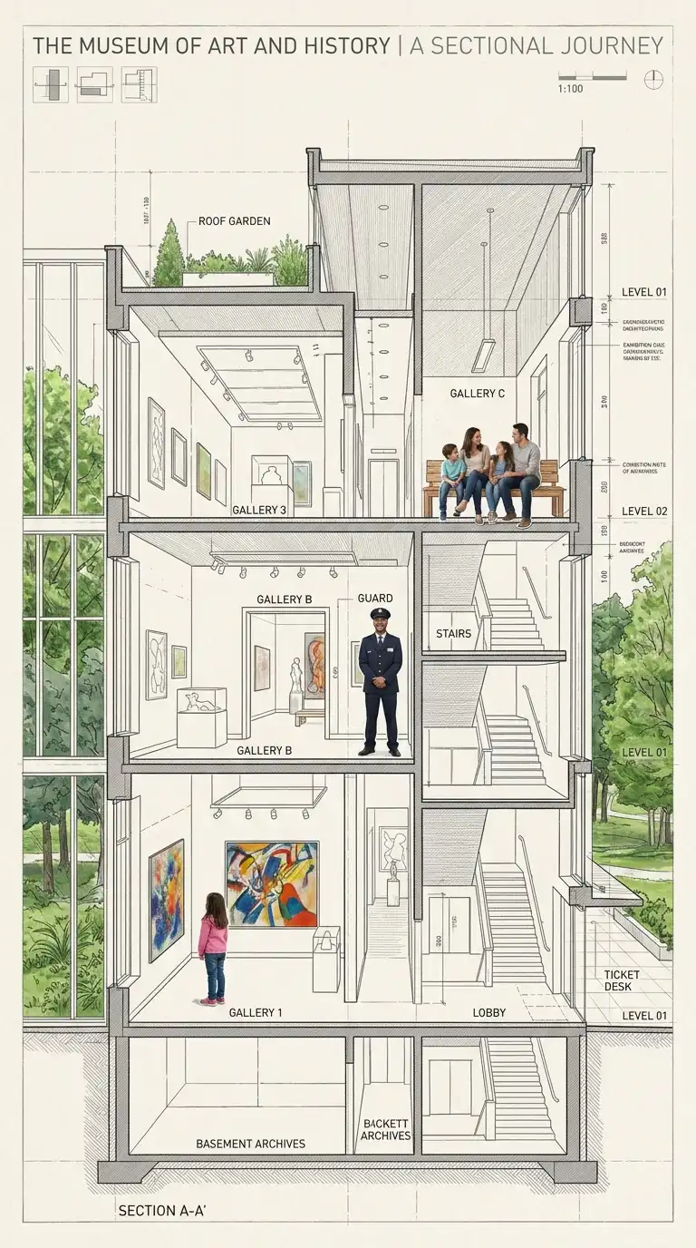
3. The Sectional Narrative Poster
The sectional narrative poster uses a building section as the primary image. But the section is populated with figures, activities, and atmospheric details. A library section shows reading figures, a tree in the courtyard, books on shelves.
The section is drawn accurately, but the collage elements add life and narrative. The poster tells a story of how the building is used. The emotional effect is lively, human, and accessible.
Quick Tips
- Keep the architectural section accurate — do not distort for effect.
- Collage figures from photographs, not generic silhouettes.
- Use colour selectively: grey for the building, warm colour for figures.
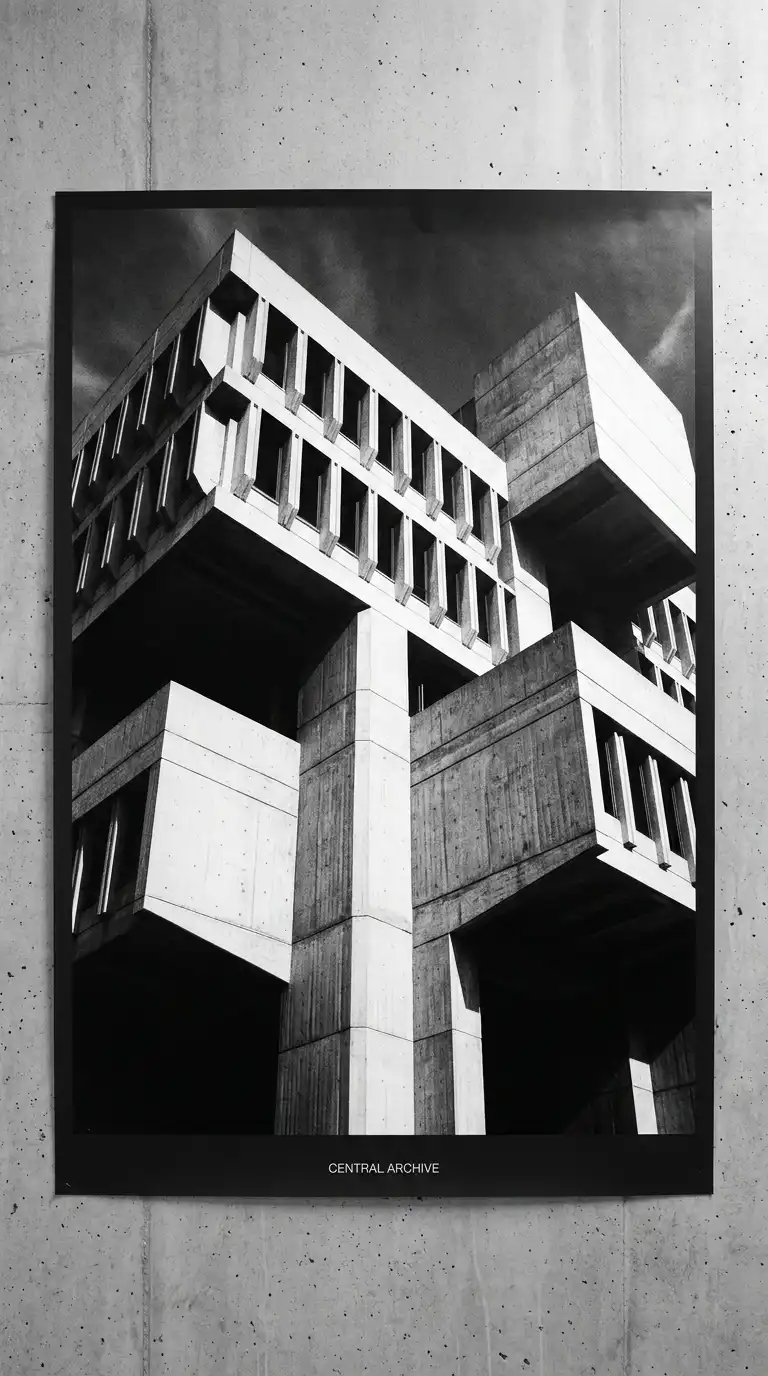
4. The Black and White Photographic Poster
The black and white photographic poster features a single, dramatic photograph of a building. The image is high-contrast, grainy, and graphically bold. Shadows are deep. Highlights are bright. The building is abstracted into light and dark masses.
The photograph occupies most of the poster. Typography is minimal: the building name, architect, date, and location set in a small, restrained typeface. The emotional effect is dramatic, timeless, and monumental.
Quick Tips
- Shoot on a cloudy day for soft light, or a sunny day for dramatic shadows.
- Convert to black and white with high contrast.
- Place typography in a consistent location: bottom edge, top edge, or aligned to a building edge.
5. The Isometric Diagram Poster
The isometric diagram poster uses simplified isometric drawings to explain a building’s systems: structure, circulation, program, light, ventilation. Multiple small isometric drawings are arranged in a grid or sequence.
Each drawing uses a restricted palette: one colour per system, grey for the building shell. The effect is analytical and educational. The poster teaches the viewer how the building works. The emotional effect is clear, rational, and informative.
Quick Tips
- Use a consistent isometric angle across all diagrams.
- Limit colour to one or two accent colours plus grey.
- Include a legend explaining each system.
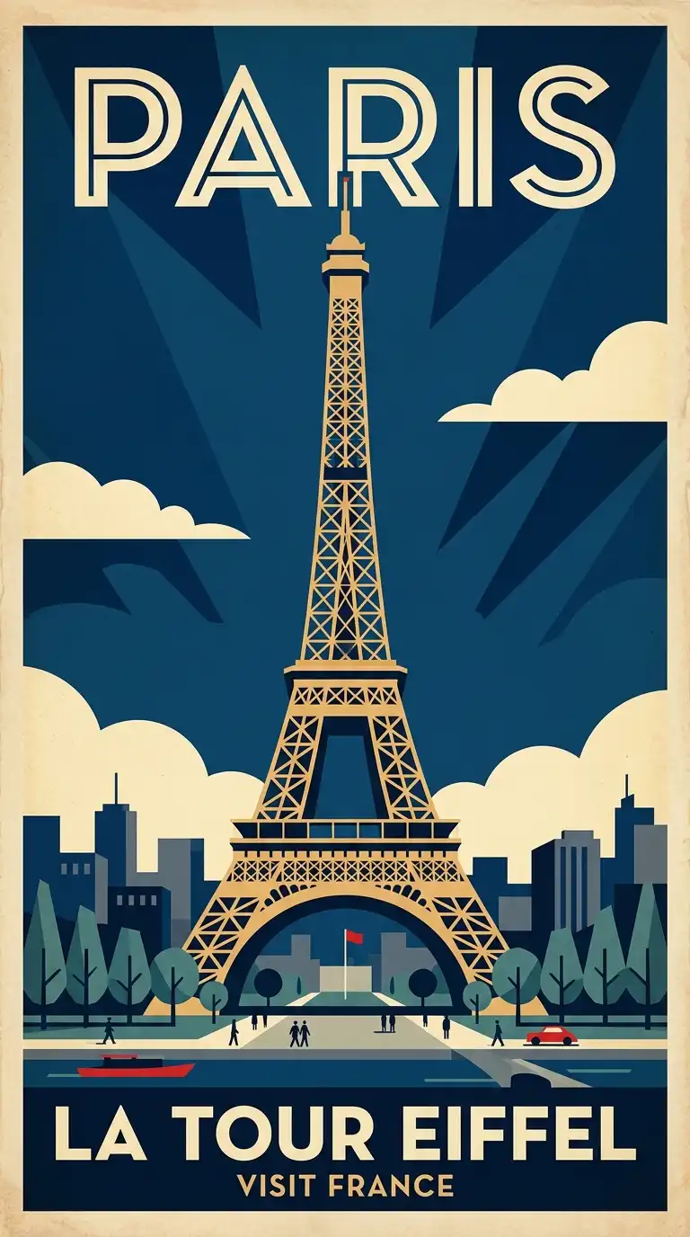
6. The Vintage Travel Poster
The vintage travel poster adapts the graphic style of early 20th-century tourism advertising for architecture. The building is illustrated in bold, flat colours with stylised shadows. The composition is simple and graphic. The typography is period-appropriate: Art Deco, sans-serif, or hand-lettered.
The poster promotes the building as a destination. The emotional effect is nostalgic, playful, and affectionate.
Quick Tips
- Use a limited palette of 3-5 bold colours.
- Simplify the building into flat shapes with no gradients.
- Choose a period-appropriate typeface: Futura, Gill Sans, or a hand-drawn script.
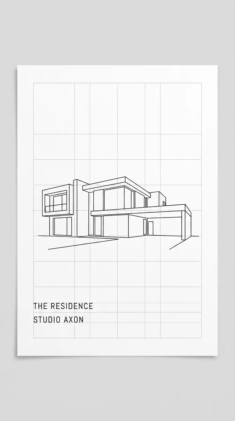
7. The Minimalist Grid Poster
The minimalist grid poster reduces the building to its essential geometry. The image is a line drawing: outline, major openings, structural grid. The drawing is placed within a strict grid system that also organises the typography.
White space is generous. Colour is absent or limited to a single accent. The emotional effect is calm, precise, and highly refined.
Quick Tips
- Use a single line weight throughout the drawing.
- Align the drawing to the typographic grid.
- Leave at least 30% of the poster as white space.
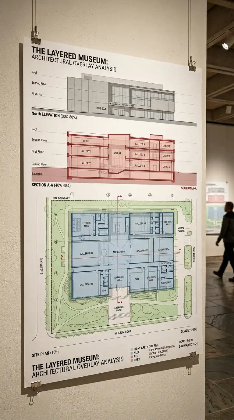
8. The Layered Transparency Poster
The layered transparency poster overlays multiple drawings of the same building at different scales or from different viewpoints. A site plan, floor plan, section, and elevation are layered on top of each other with partial transparency.
The effect is dense and complex. The viewer reads through layers, understanding the building at multiple scales simultaneously. The emotional effect is intellectual, dense, and richly informative.
Quick Tips
- Use transparency between 30-50% so lower layers remain readable.
- Colour-code layers by scale or drawing type.
- Keep the most important drawing on top or at full opacity.
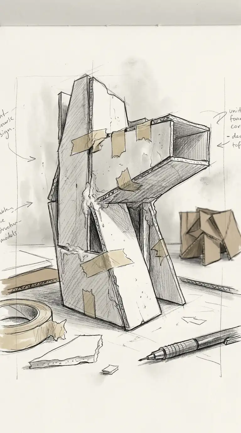
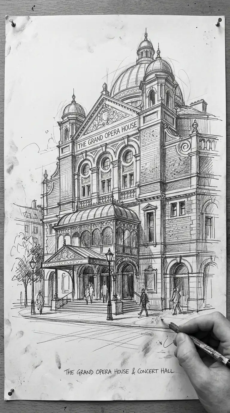
9. The Hand-Drawn Sketch Poster
The hand-drawn sketch poster celebrates the architectural sketch as finished work. The primary image is a large, expressive hand drawing: loose, energetic, and obviously not traced. The drawing shows not only the building but the architect’s hand.
Typography is handwritten or set in a typeface that mimics handwriting. The emotional effect is personal, energetic, and authentic.
Quick Tips
- Use a large sheet of paper and draw at final poster size.
- Scan at high resolution (300dpi minimum) to preserve line quality.
- Do not over-clean the sketch — preserve erasures, smudges, and corrections.
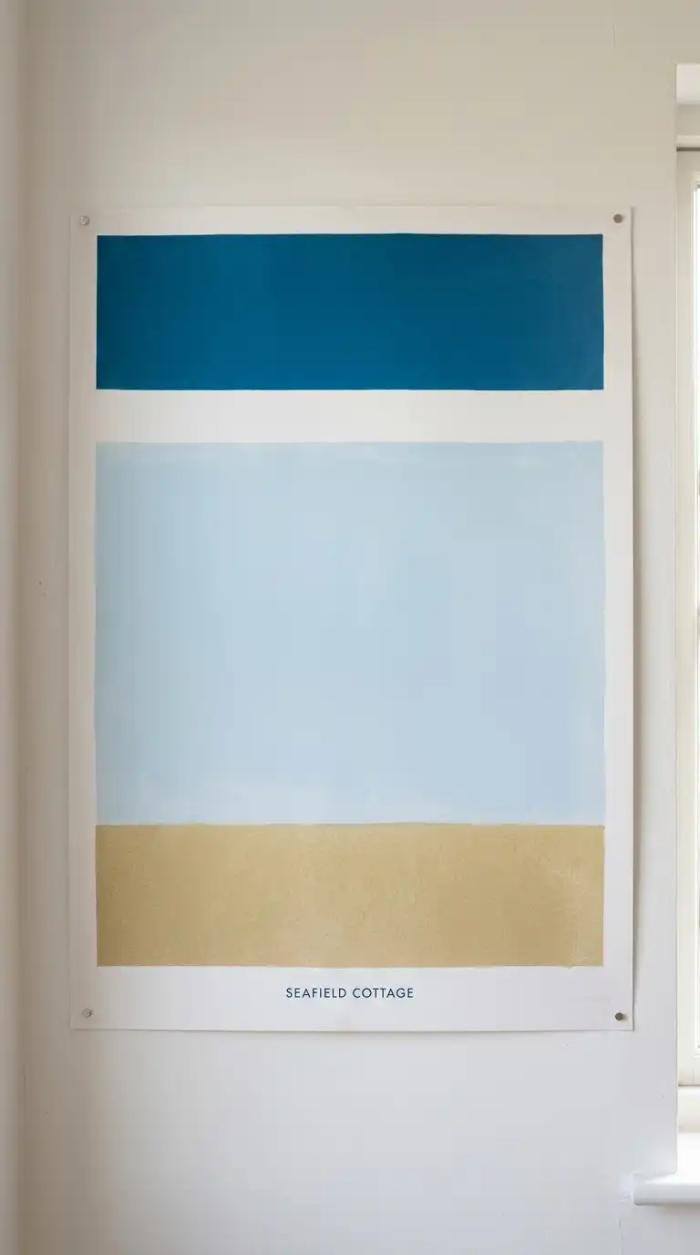
10. The Colour Field Poster
The colour field poster uses large areas of flat colour to evoke the atmosphere of a building. The building itself may be absent, represented only by its colours, proportions, and geometries. A poster for a white concrete building might use shades of grey and white in horizontal bands.
The emotional effect is abstract, atmospheric, and emotional. The poster does not show the building — it shows how the building feels.
Quick Tips
- Extract colours from photographs of the building.
- Use the building’s proportions to determine colour field divisions.
- The building’s name can be the only representational element.
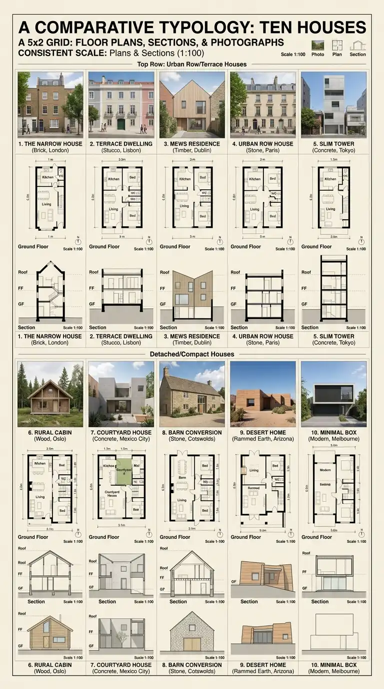
11. The Comparative Typology Poster
The comparative typology poster presents multiple buildings of the same type arranged in a grid or sequence. Ten houses, ten museums, ten towers. Each building is shown with the same set of drawings: plan, section, elevation, photograph.
The viewer compares across the grid, understanding the typology through variation. The emotional effect is scholarly, systematic, and comprehensive.
Quick Tips
- Use the same drawing types and scale for every building.
- Arrange buildings chronologically, geographically, or by size.
- Include a key or legend identifying each building.
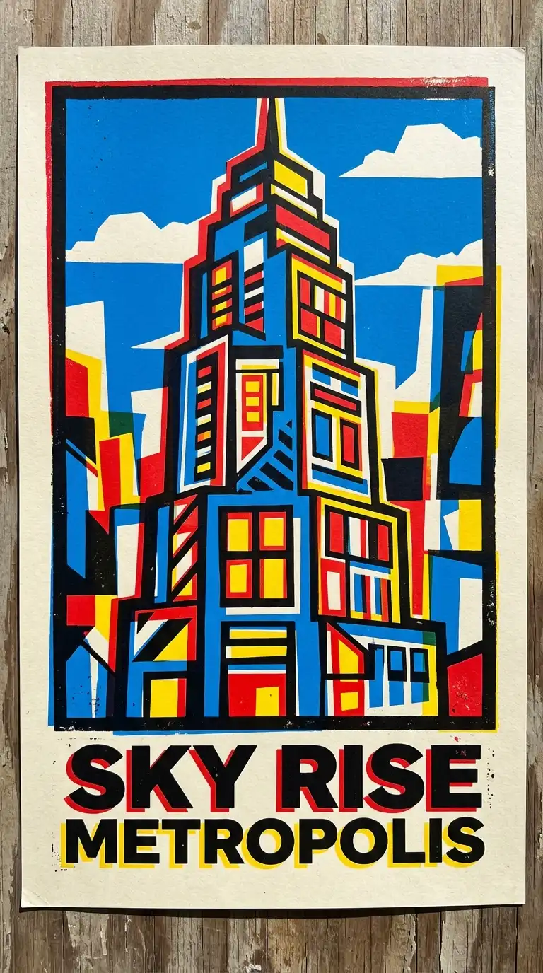
12. The Silkscreen Poster
The silkscreen poster uses the visual language of screen printing: bold colours, hard edges, overlapping transparencies, and registration imperfections. The image is built from separate colour layers that do not quite align.
This technique works well for graphic, simplified architectural images. A building reduced to five bold colours, printed with deliberate misregistration. The emotional effect is graphic, handmade, and slightly punk.
Quick Tips
- Limit your palette to 3-6 colours.
- Design each colour as a separate layer.
- Embrace imperfect registration — it is part of the aesthetic.
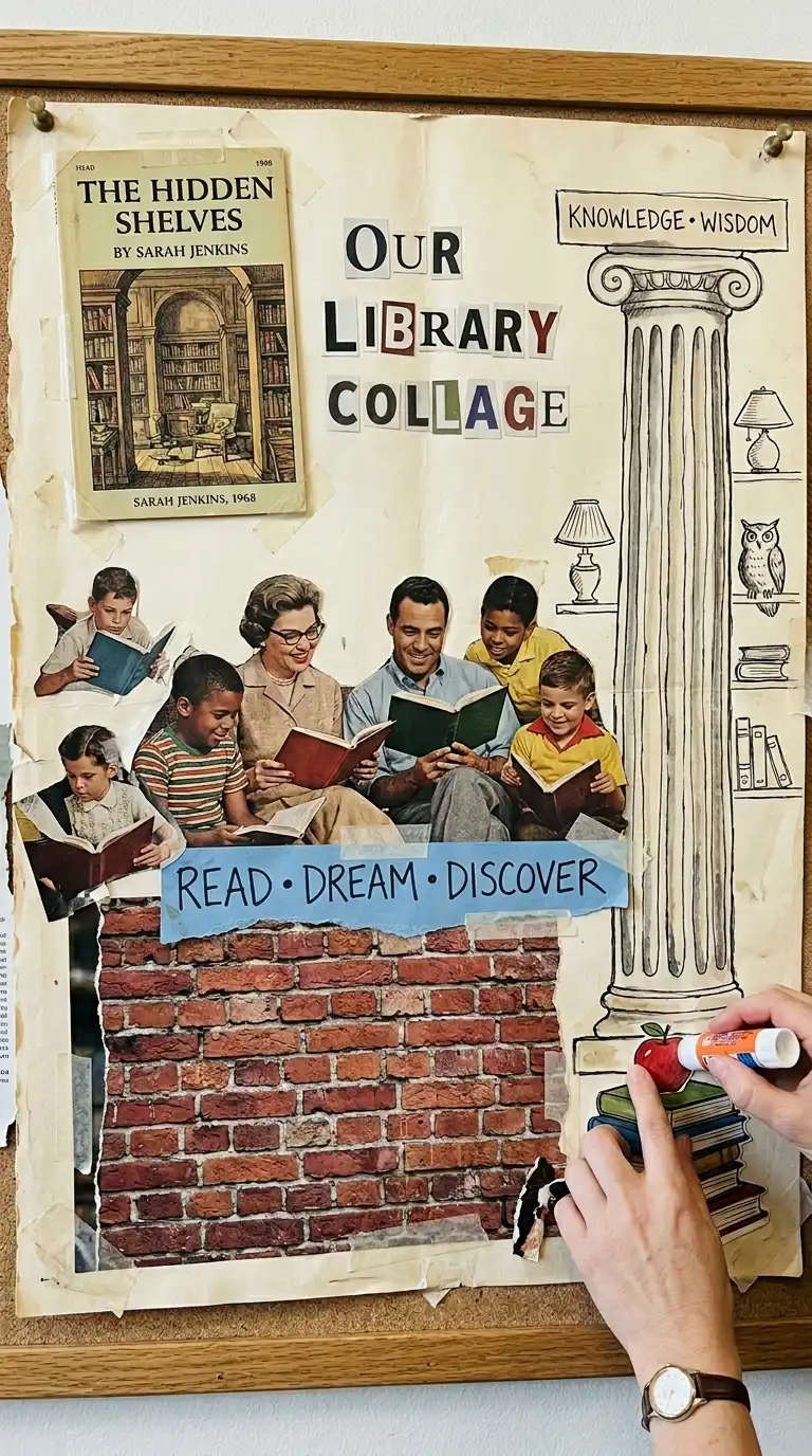
13. The Collage Poster
The collage poster assembles found images, textures, and drawings into a single composition. The building may be represented by fragments: a column from one photograph, a window from another, a figure from a magazine. The composition is layered, dense, and surprising.
The emotional effect is surreal, poetic, and open to interpretation. The collage poster does not explain the building — it evokes it.
Quick Tips
- Collect source materials before composing: magazines, photographs, drawings.
- Use a neutral background so the collage elements stand out.
- Glue or tape elements physically for an analogue collage, or scan and assemble digitally.
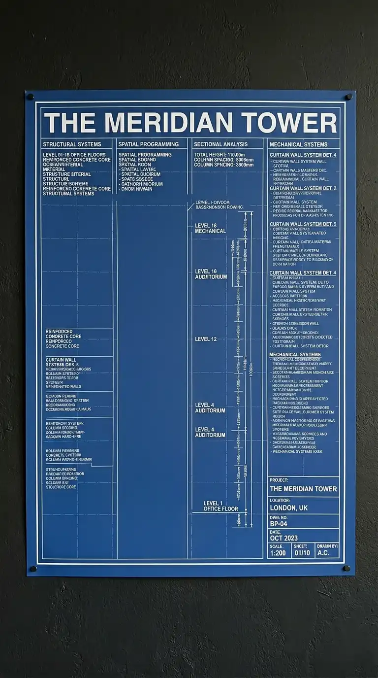
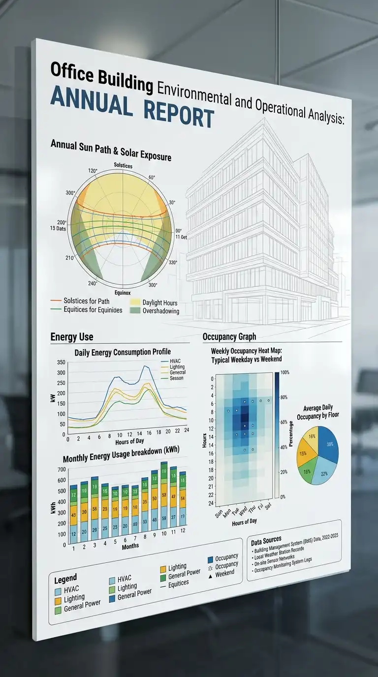
14. The Data Poster
The data poster presents quantitative information about a building or site: sun angles, wind patterns, energy use, occupancy, material quantities. The data is visualised as diagrams, charts, graphs, and maps.
The building itself may be a faint line drawing behind the data. The emotional effect is analytical, evidence-based, and persuasive.
Quick Tips
- Choose the most important data set and make it dominant.
- Use colour consistently across all charts and diagrams.
- Include a clear legend and data sources.
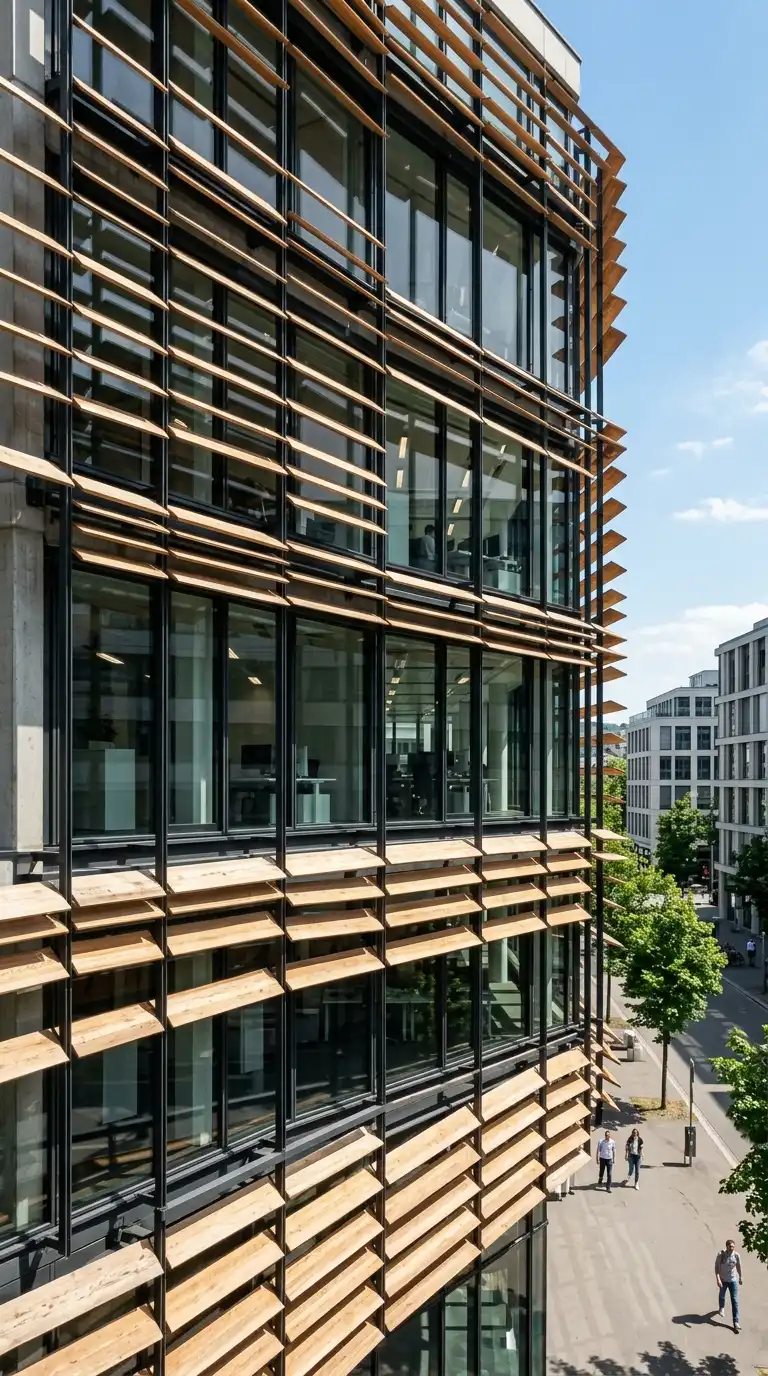
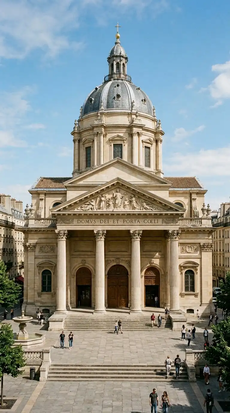
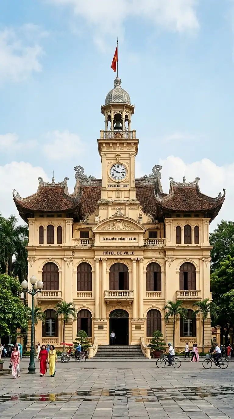
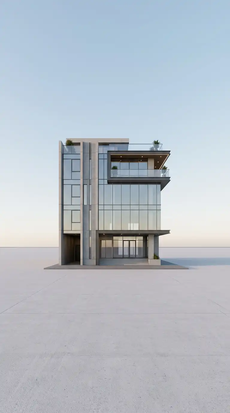
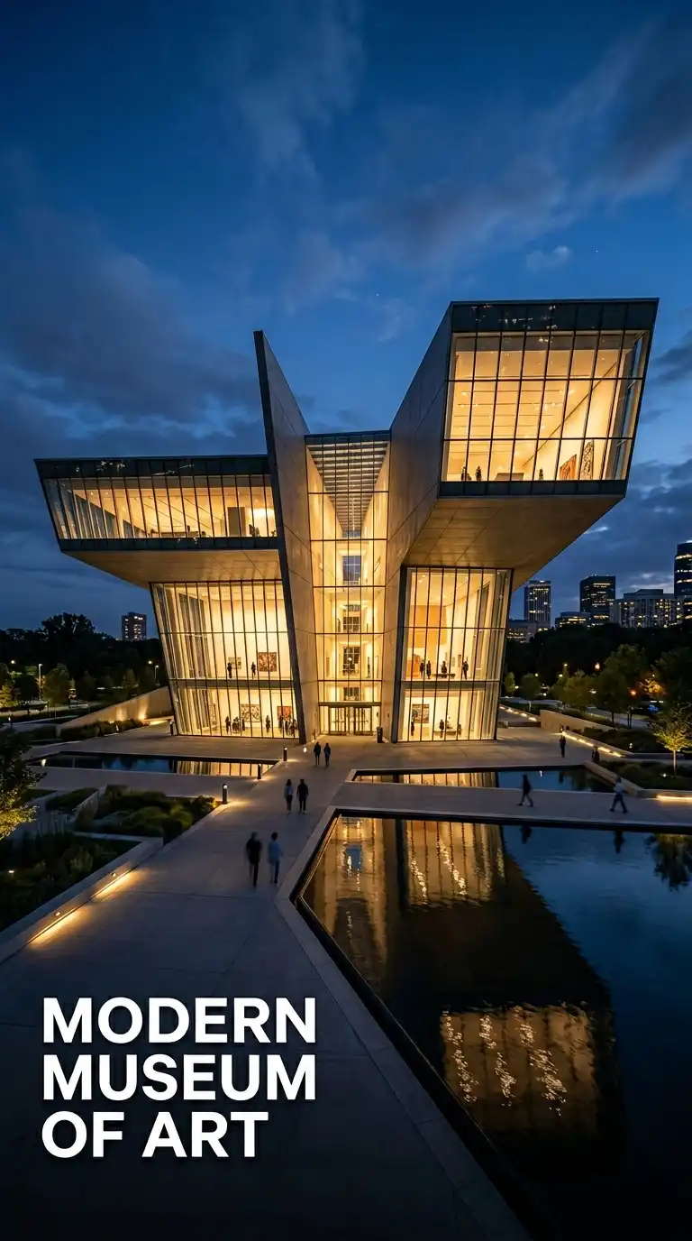
15. The Hero Image Poster
The hero image poster features a single, large, full-bleed image of the building. The image fills the entire poster — edge to edge, top to bottom. Typography is overlaid on the image in a bold, simple typeface, placed in a consistent location.
This poster type is for maximum visual impact. The image must be extraordinary — a dramatic perspective, an unusual angle, a beautiful light. The emotional effect is bold, immersive, and unforgettable.
Quick Tips
- The image must be high resolution — it will fill the entire poster.
- Place typography where it contrasts with the image (dark text on light area, light on dark).
- Keep text minimal — building name, architect, date, location.
Final Thoughts
An architecture poster is not a drawing enlarged. It is a distinct medium with its own demands: boldness, legibility from a distance, and a single, clear message. The best architecture posters understand their audience — whether that audience is walking through a gallery, browsing a conference, or studying a pin-up board.
These 15 poster ideas are not mutually exclusive. A sectional narrative can be printed as a silkscreen. A typographic blueprint can include an isometric diagram. A black and white photograph can be overlaid with data. The best posters draw from multiple approaches, adapting and combining to fit the specific building, message, and audience.