Layout architecture is the arrangement of elements on a page — drawings, images, text, and white space. A good layout is not noticed. A bad layout is impossible to ignore. The best layouts guide the eye, establish hierarchy, and make complex information understandable. Layout is not decoration — it is communication.
These 12 layout architecture ideas span presentation boards, portfolios, posters, and reports. Each idea includes defining characteristics, grid strategies, and typographic principles.
1. The Single-Column Layout
The single-column layout is the simplest layout. One column runs down the page. Images and text are stacked vertically. The single-column layout is easy to read and easy to design. It is ideal for long texts and sequential images.
This layout is ideal for reports, theses, and portfolios with a narrative. The emotional effect is simple, clear, and sequential.
Quick Tips
- Keep the column narrow (50-70 characters per line).
- Use white space between elements.
- Align all elements to the same left edge.
2. The Two-Column Layout
The two-column layout splits the page into two vertical columns. Text in one column, images in the other. Or both columns have text and images. The two-column layout is efficient and versatile. It is ideal for portfolios and magazines.
This layout is ideal for portfolios, magazines, and reports with many images. The emotional effect is efficient, balanced, and versatile.
Quick Tips
- Keep the columns equal width or one wider than the other.
- Align elements to the column grid.
- Use a visible or invisible grid.
3. The Three-Column Layout
The three-column layout splits the page into three vertical columns. The three-column layout is dense and efficient. It is ideal for image-heavy portfolios and catalogues. The three-column layout requires careful attention to hierarchy.
This layout is ideal for image-heavy portfolios, catalogues, and grids. The emotional effect is dense, efficient, and grid-like.
Quick Tips
- Keep columns narrow (15-25 characters per line for text).
- Use white space between columns.
- Vary image sizes within the grid.
4. The Grid Layout
The grid layout organises elements in a regular grid of rows and columns. The grid can be 2×2, 3×2, 3×3, or any combination. The grid is strict and consistent. The grid layout is rational, efficient, and architectural.
This layout is ideal for portfolios, catalogues, and technical presentations. The emotional effect is rational, efficient, and orderly.
Quick Tips
- Choose a grid (2×2, 3×2, 3×3) and stick to it.
- Leave consistent gaps between cells.
- Crop all images to the same aspect ratio.

5. The Full-Bleed Layout
The full-bleed layout prints images edge to edge, with no margins. The image fills the entire page. Text is overlaid on the image. The full-bleed layout is dramatic and immersive. It is ideal for hero images and portfolios.
This layout is ideal for portfolios, posters, and covers. The emotional effect is dramatic, immersive, and bold.
Quick Tips
- Images must be high resolution (300dpi at final size).
- Place text where it contrasts with the image.
- Critical content must be away from the trim line (at least 1cm).

6. The Asymmetrical Layout
The asymmetrical layout is not balanced on a centre line. One side has a large image. The other side has small text. The asymmetrical layout is dynamic and modern. It uses visual weight, not symmetry, to balance the page.
This layout is ideal for portfolios, posters, and creative presentations. The emotional effect is dynamic, modern, and unexpected.
Quick Tips
- Use visual weight to balance the page.
- Avoid mirroring elements.
- The layout should feel intentional, not random.
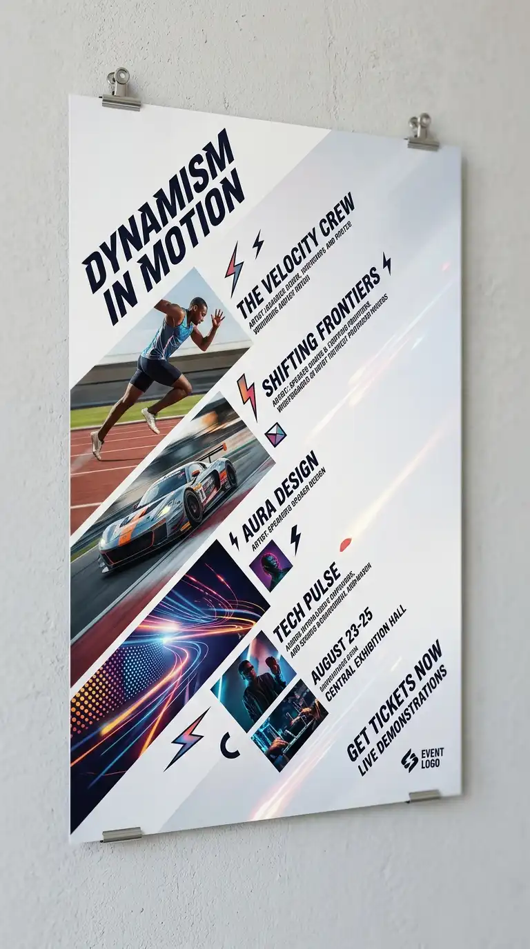
7. The Diagonal Layout
The diagonal layout organises elements along a diagonal axis. Images and text are placed on a diagonal line from top-left to bottom-right or top-right to bottom-left. The diagonal layout is dynamic and unexpected. It is ideal for posters and creative portfolios.
This layout is ideal for posters, covers, and creative presentations. The emotional effect is dynamic, diagonal, and unexpected.
Quick Tips
- Establish a diagonal axis first.
- Place elements along the axis.
- Leave empty space on the opposite diagonal.
8. The Hierarchical Layout
The hierarchical layout uses size and position to establish importance. The most important element is largest, at the top. The least important element is smallest, at the bottom. The hierarchical layout guides the eye from most important to least important.
This layout is ideal for posters, covers, and title pages. The emotional effect is clear, guided, and hierarchical.
Quick Tips
- The most important element must be the largest.
- The least important element must be the smallest.
- The eye should move from top to bottom, left to right.
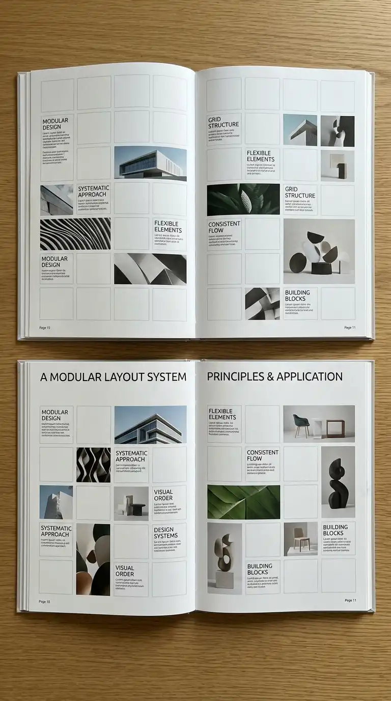
9. The Modular Layout
The modular layout uses a module — a small, repeated unit — to build the page. The module can be a square, a rectangle, or a shape. The modules are arranged in a grid. The modular layout is flexible and systematic.
This layout is ideal for catalogues, portfolios, and complex presentations. The emotional effect is modular, systematic, and flexible.
Quick Tips
- Choose a module size (e.g., 5cm square).
- Build the page from modules.
- Elements can span one module or multiple modules.
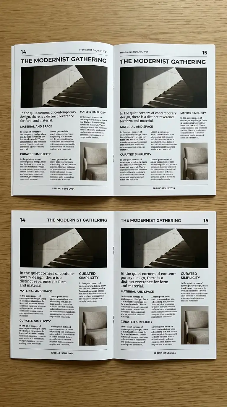
10. The Serial Layout
The serial layout repeats the same layout on every page. The reader knows what to expect. The serial layout is consistent and predictable. It is ideal for long documents and reports.
This layout is ideal for theses, reports, and consistent portfolios. The emotional effect is consistent, predictable, and professional.
Quick Tips
- Use the same grid on every page.
- Use the same typeface and type sizes.
- Place page numbers in the same location.
11. The Varied Layout
The varied layout changes from page to page. Every page has a different layout. The varied layout is dynamic and surprising. It is ideal for portfolios and creative presentations.
This layout is ideal for portfolios, art books, and creative presentations. The emotional effect is dynamic, surprising, and creative.
Quick Tips
- Every page should be different.
- Maintain a consistent typographic voice.
- Use a consistent colour palette.
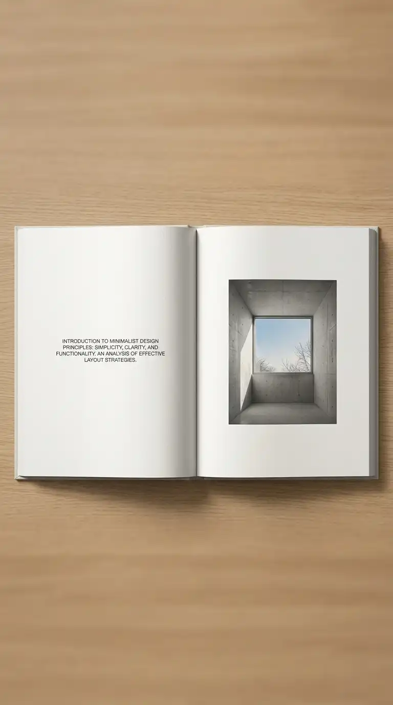
12. The Minimalist Layout
The minimalist layout uses generous white space, a single typeface, and no decoration. The content is the only subject. The minimalist layout is calm, confident, and professional. It is ideal for high-end portfolios and monographs.
This layout is ideal for portfolios, monographs, and art books. The emotional effect is calm, confident, and professional.
Quick Tips
- Leave at least 30% white space on every page.
- Use a single typeface throughout.
- No decoration, no ornament, no colour (except images).
Final Thoughts
Layout is not decoration. It is communication. A single-column layout is simple and clear. A two-column layout is efficient and versatile. A three-column layout is dense and grid-like. A grid layout is rational and orderly. A full-bleed layout is dramatic and immersive. An asymmetrical layout is dynamic and modern. A diagonal layout is dynamic and unexpected. A hierarchical layout is clear and guided. A modular layout is systematic and flexible. A serial layout is consistent and professional. A varied layout is dynamic and surprising. A minimalist layout is calm and confident.
These 12 layout ideas are not mutually exclusive. A grid layout can be asymmetrical. A modular layout can be hierarchical. A serial layout can be minimalist. The best layouts are not the most complex — they are the most appropriate. They fit the content, the audience, and the medium. They guide the eye. They establish hierarchy. They make complex information understandable. They are not noticed — but their absence is.