Watercolor is the most expressive architectural drawing medium. Unlike ink or digital rendering, watercolor is unpredictable. It bleeds, blooms, and mixes on the page. It captures atmosphere, light, and mood in ways that hard-line drawings cannot. Watercolor is not for technical precision — it is for poetry.
These 12 watercolor architecture ideas span techniques, subjects, and applications. Each idea includes defining characteristics, material suggestions, and artistic approaches.
1. The Atmospheric Sky
The sky is the backdrop for any architectural watercolor. A dramatic sky — stormy clouds, sunset gradients, or soft haze — sets the mood for the entire image. The building below is almost incidental. The sky is the subject.
Wet-on-wet technique is essential. Wet the paper first, then drop in pigments. Let the colours bleed and bloom. The emotional effect is dramatic, moody, and atmospheric.
Quick Tips
- Use a large brush (size 12 or larger) for broad washes.
- Work quickly — the paper dries fast.
- Leave some white paper for clouds.
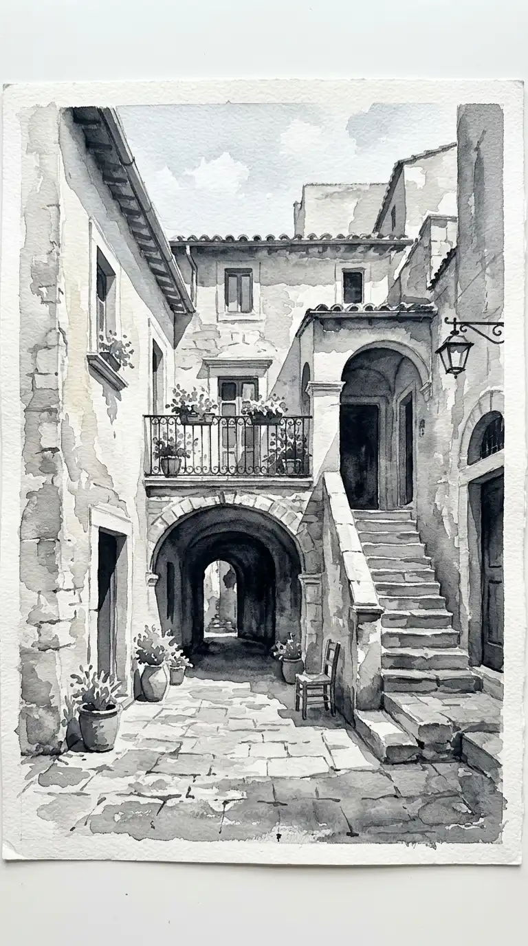
2. The Monochrome Wash
The monochrome wash uses a single pigment in varying dilutions. Dark, saturated washes for shadows. Pale, diluted washes for light surfaces. White paper for highlights. No colour — just value.
This technique is ideal for studying light and shadow without the distraction of colour. The emotional effect is calm, restrained, and architectural.
Quick Tips
- Use a neutral pigment: Paynes grey, neutral tint, or sepia.
- Mix at least five values from pale to dark.
- Paint from light to dark — preserve the lights with masking fluid.
3. The Limited Palette
The limited palette uses three or four pigments only. A warm earth (burnt sienna), a cool earth (raw umber), a blue (ultramarine), and maybe a yellow (ochre). All colours are mixed from these.
This technique creates harmonious, muted images. The colours never clash because they are all related. The emotional effect is warm, unified, and painterly.
Quick Tips
- Choose pigments that mix well together — test before painting.
- Avoid bright, pure colours straight from the tube.
- Let the pigments mix on the paper, not just on the palette.
4. The Line and Wash
Line and wash combines ink drawing with watercolor wash. The ink provides structure and detail. The wash provides colour and atmosphere. The two work together — neither dominates.
Draw the building first in waterproof ink. Let the ink dry completely. Then add watercolor washes. The emotional effect is crisp, colourful, and graphic.
Quick Tips
- Use waterproof ink — fountain pen ink will bleed.
- Draw with a fine nib (0.3mm or 0.5mm) for delicate lines.
- Keep the wash loose — do not colour inside the lines.
5. The Direct Wash (No Drawing)
The direct wash has no ink lines. No pencil underdrawing. The building is painted directly in watercolour, with no outline to contain it. The form emerges from washes of colour.
This technique is loose and expressive. It requires confidence — you cannot erase. The emotional effect is painterly, spontaneous, and fresh.
Quick Tips
- Start with the lightest washes, build to the darkest.
- Leave white paper for highlights — you cannot paint white over colour.
- Work quickly while the paper is wet for soft edges.
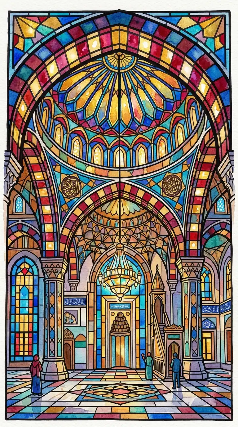
6. The Stained Glass Effect
The stained glass effect uses saturated, jewel-like colours applied in discrete patches. The colours do not blend. Each patch is separated by white paper or dark lines. The effect is like a stained glass window — luminous and segmented.
This technique is ideal for depicting coloured glass, tile, or mosaic. The emotional effect is vibrant, decorative, and luminous.
Quick Tips
- Use transparent pigments — opaque colours will not glow.
- Leave white paper between colour patches.
- Add dark lines (ink or dark wash) after the colour dries.
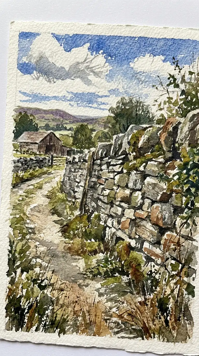
7. The Dry Brush
The dry brush technique uses very little water. The brush is almost dry. The pigment catches on the texture of the paper, leaving a broken, textured mark. Dry brush is ideal for rough materials: stone, brick, timber, concrete.
The emotional effect is textured, rough, and tactile. The paper grain becomes part of the image.
Quick Tips
- Use a stiff brush (hog bristle or synthetic).
- Blot the brush on a towel before painting.
- Drag the brush lightly over the paper — do not scrub.
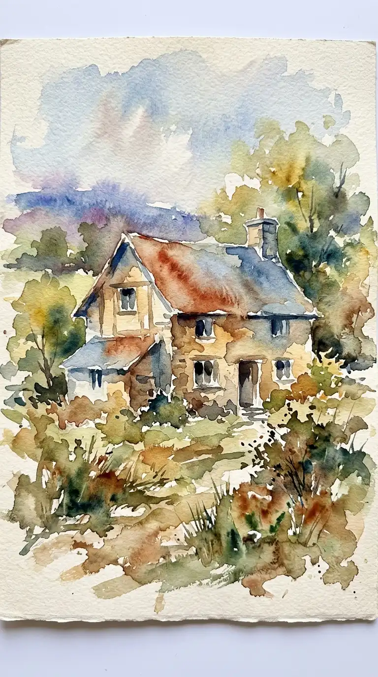
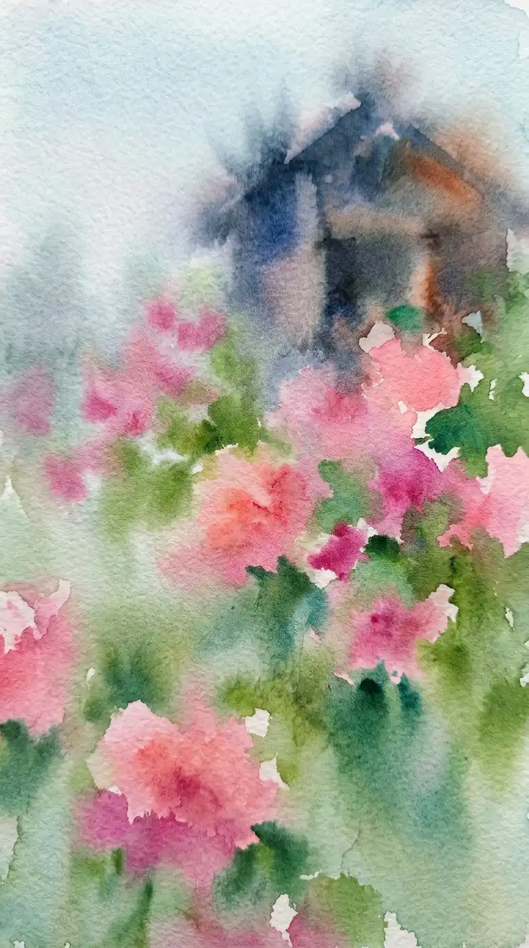
8. The Wet-in-Wet Bloom
The wet-in-wet bloom is a watercolour accident turned into a technique. Wet pigment is dropped onto wet paper. The pigment blooms outward in irregular, organic shapes. The result is soft, unpredictable, and beautiful.
This technique is ideal for skies, gardens, and atmospheric effects. The emotional effect is soft, dreamy, and uncontrolled.
Quick Tips
- Wet the paper thoroughly before painting.
- Drop pigment onto the wet surface — do not brush it.
- Let the pigment bloom on its own. Do not push it.
9. The Negative Painting
Negative painting paints the space around the building, not the building itself. The building is preserved as white paper while the background is painted. The building emerges from the negative space.
This technique forces you to see shapes differently. The emotional effect is graphic, bold, and surprising.
Quick Tips
- Mask the building with masking fluid or leave it as white paper.
- Paint the sky, ground, and surrounding buildings.
- Remove the mask at the end to reveal the white building.
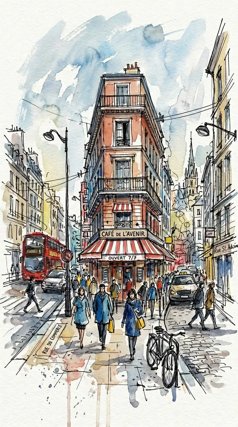
10. The Urban Sketch
The urban sketch is quick, loose, and on location. The goal is not accuracy but impression. The sketch captures the feeling of a place in a few minutes. Lines are energetic. Washes are fast.
This technique is ideal for travel sketches, site analysis, and design journals. The emotional effect is immediate, energetic, and authentic.
Quick Tips
- Work small — A5 or A6 is ideal.
- Set a timer for 10-15 minutes.
- Do not correct mistakes — keep moving.
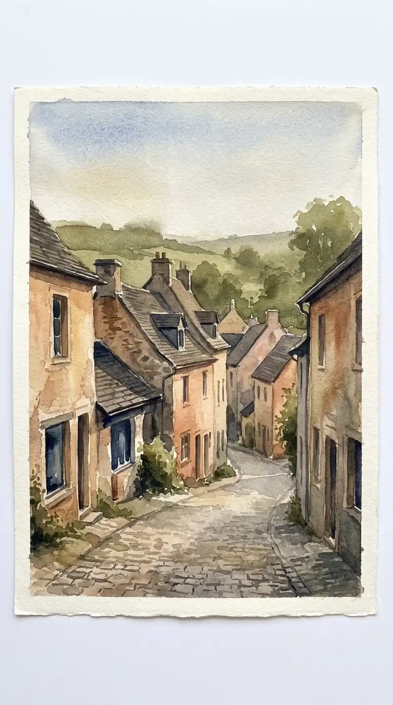
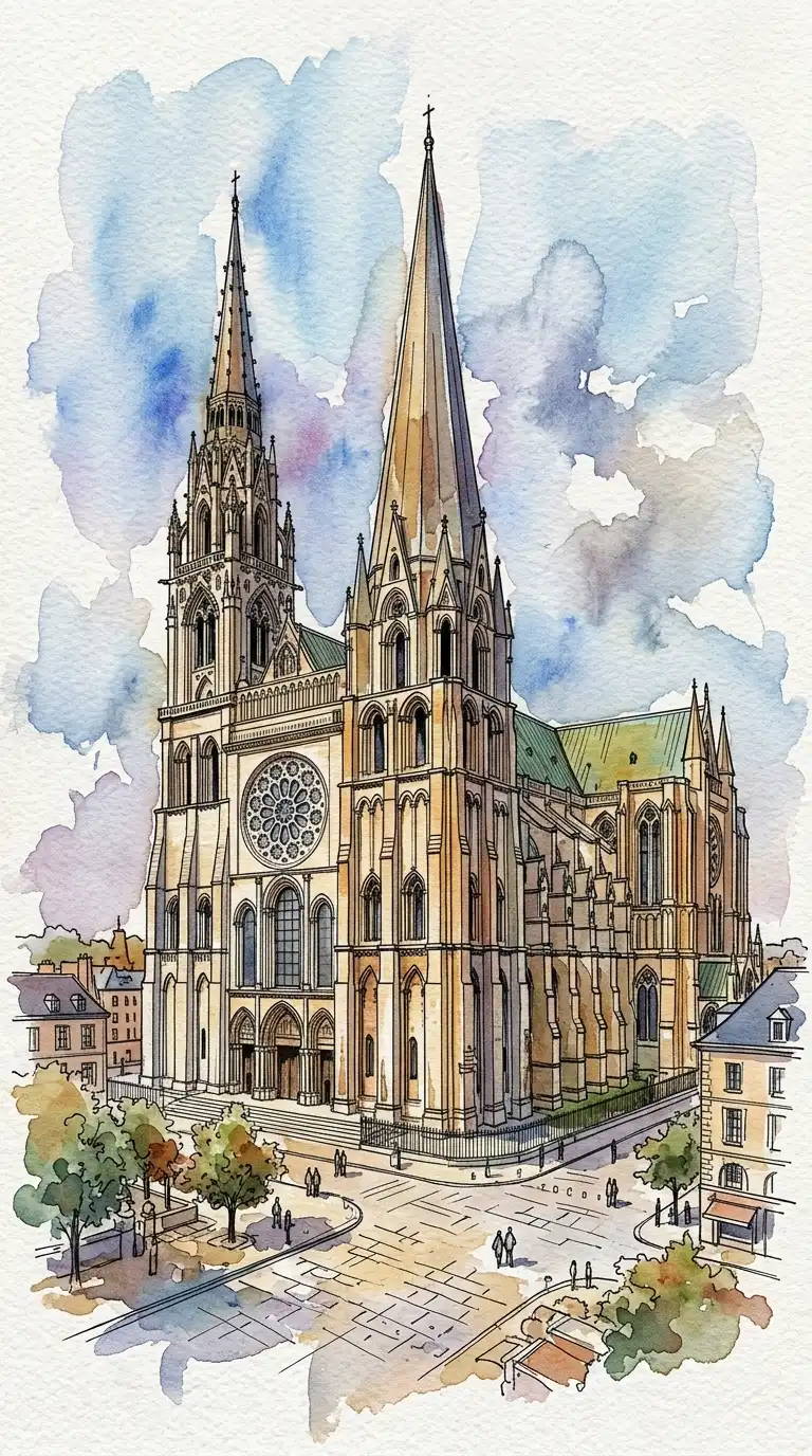
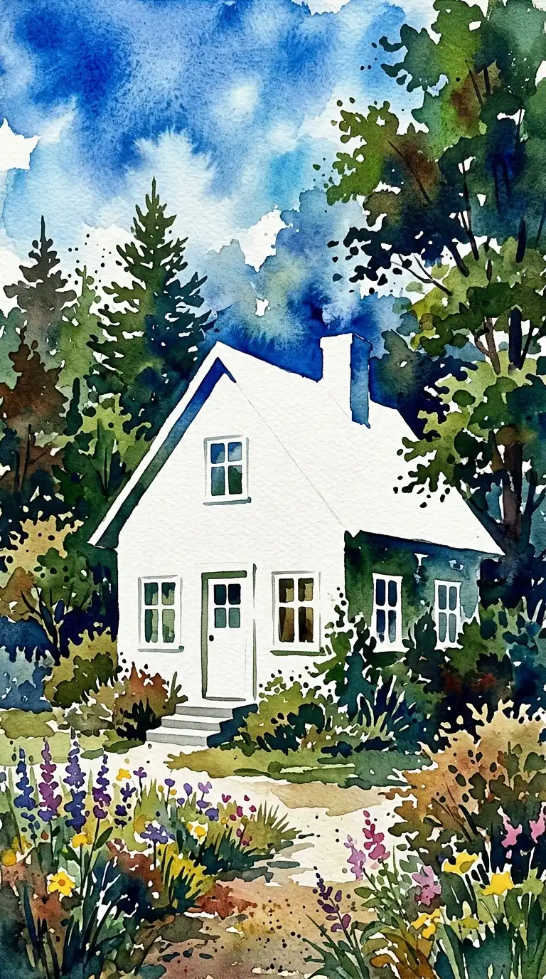
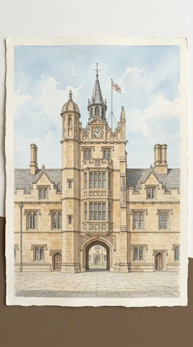
11. The Architectural Portrait
The architectural portrait is a detailed, accurate watercolor of a single building. The building is centred, filling most of the page. The drawing is precise. The colour is natural and restrained.
This technique is ideal for client presentations, heritage documentation, and competition entries. The emotional effect is respectful, precise, and beautiful.
Quick Tips
- Draw the building carefully in pencil first.
- Build colour in thin layers (glazes) — do not paint dark too soon.
- Save details (windows, doors, ornament) for the final layer.
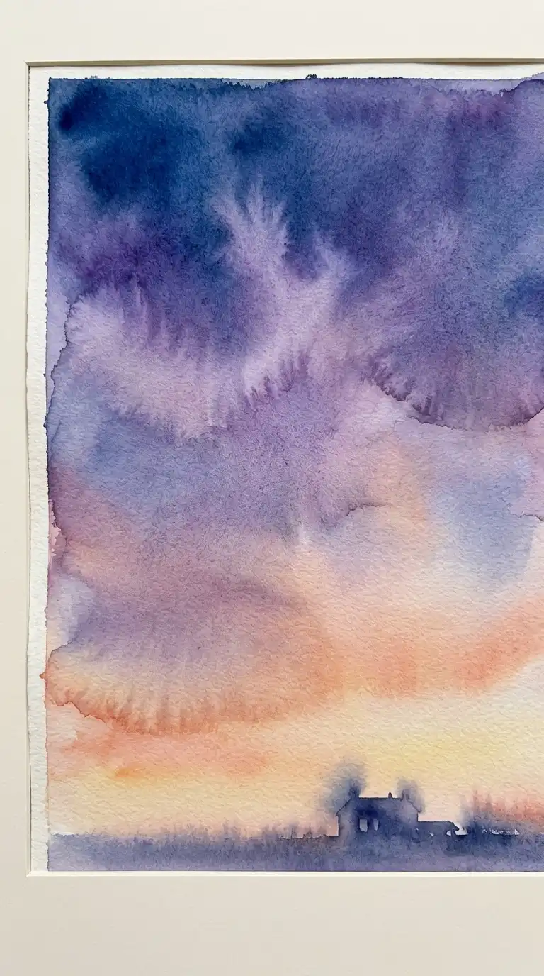
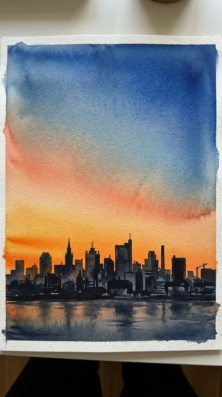
12. The Colour Gradient Sky
The colour gradient sky transitions smoothly from one colour to another. Warm sunset colours at the horizon. Cool blues at the top. The transition is seamless, with no hard edge.
This technique requires speed and control. The paper must stay wet while the gradient is painted. The emotional effect is dramatic, beautiful, and atmospheric.
Quick Tips
- Wet the entire sky area before painting.
- Paint the lightest colour first, then add darker colours while wet.
- Tilt the paper to help colours flow.
Final Thoughts
Watercolor is the most expressive architectural drawing medium. It rewards confidence and punishes hesitation. The best watercolours are not the most accurate — they are the most alive.
These 12 techniques are not mutually exclusive. A line and wash can have a wet-in-wet sky. A monochrome wash can be painted on textured paper. A spontaneous sketch can use a limited palette. The best watercolor architects move fluidly between techniques, choosing the right approach for the building, the light, and the mood.