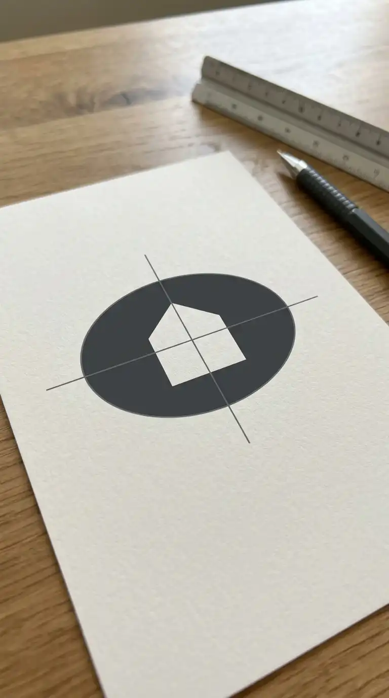
An architecture logo is a visual signature. It appears on letterheads, websites, business cards, and building signage. A great architecture logo is not a drawing of a building. It is an abstraction — a symbol that suggests architecture through geometry, line, form, and negative space. The best architecture logos are simple, memorable, and scalable.
These 24 architecture logo ideas span abstract marks, typographic solutions, and hybrid designs. Each idea includes defining characteristics, applications, and design principles.
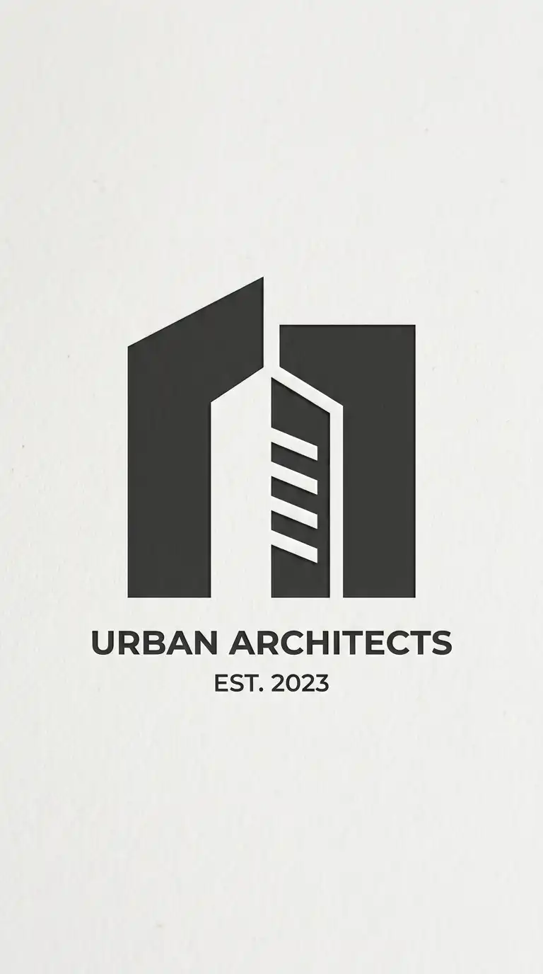
1. The Abstract Building Mark
The abstract building mark reduces a building to its essential geometry. A rectangle, a triangle for a roof, a few lines for windows. The form is simplified to the point of abstraction. The logo is not a picture of a building — it is the idea of a building.
This logo type works for general architecture firms. The emotional effect is professional, iconic, and architectural.
Quick Tips
- Use no more than three geometric shapes.
- Negative space can suggest windows or openings.
- Keep the form simple enough to read at small sizes.
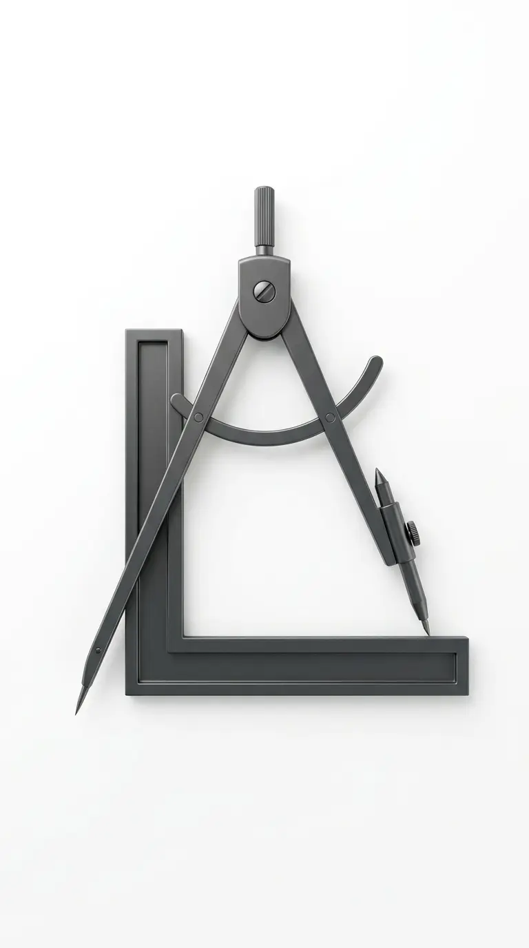
2. The Compass and Square
The compass and square is a traditional symbol of architecture. The compass draws circles. The square measures right angles. Together, they represent the tools of the architect. This logo type is classical, scholarly, and traditional.
This logo works for firms that value tradition and precision. The emotional effect is traditional, precise, and learned.
Quick Tips
- The compass should be drawn with thin lines, the square with thick.
- Overlap the two forms for a more dynamic composition.
- Use negative space to hide a building form within the tools.
3. The Initials in a Box
The initials in a box logo places the firm’s initials inside a square or rectangle. The box suggests a building plan. The initials are the program inside. The negative space around the letters becomes walls or courtyards.
This logo works for firms with two or three initials. The emotional effect is professional, architectural, and modern.
Quick Tips
- The box should be a square or a golden rectangle.
- Letters should be custom-drawn or carefully chosen.
- The negative space between letters should be considered.
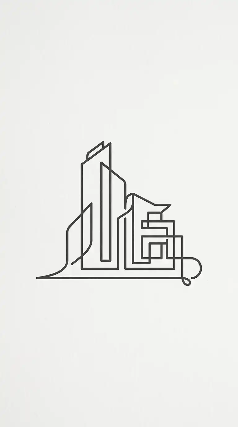
4. The Single Line Drawing
The single line drawing logo is a continuous line that traces a building form. The line never lifts from the paper. The drawing is minimal, elegant, and abstract. The line suggests a roof, a wall, a stair, a column.
This logo works for firms that value minimalism and craft. The emotional effect is elegant, continuous, and handcrafted.
Quick Tips
- The line should be continuous — no breaks.
- The drawing should be abstract, not literal.
- Use a single line weight throughout.
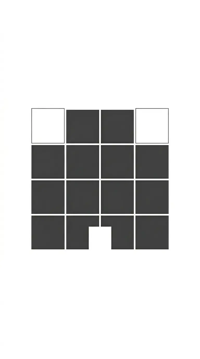
5. The Grid Logo
The grid logo uses a modular grid to suggest architectural planning. The grid can be regular or irregular. The logo might be a grid alone, or a building form subtracted from a grid. The grid suggests order, precision, and rationality.
This logo works for large firms and corporate practices. The emotional effect is ordered, precise, and systematic.
Quick Tips
- Use a square grid (2×2, 3×3, or 4×4).
- Remove some squares to create a building silhouette.
- Keep the grid lines thin and consistent.
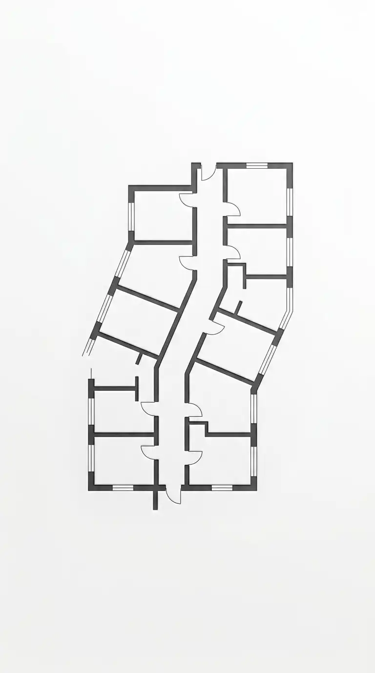
6. The Plan Abstraction
The plan abstraction logo uses a fragment of a floor plan as the mark. A corridor with rooms. A staircase. A courtyard. The plan is cropped so it is no longer readable as a specific building. It becomes a pattern.
This logo works for firms that specialise in spatial design. The emotional effect is architectural, spatial, and abstract.
Quick Tips
- Use a real plan from a significant project, then abstract it.
- Crop the plan so it is no longer recognisable.
- Use thick lines for walls, thin lines for openings.
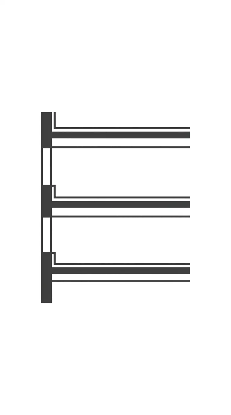
7. The Section Abstraction
The section abstraction logo uses a fragment of a building section. A floor slab, a wall, a roof. The section is cropped so it becomes an abstract stack of horizontal lines. The logo suggests structure, layering, and vertical organisation.
This logo works for firms that specialise in high-rise or complex structures. The emotional effect is structural, layered, and vertical.
Quick Tips
- Use a real section from a significant project.
- Crop the section to a fragment.
- Emphasise the horizontal lines of floors and roofs.
8. The Negative Space Building
The negative space building logo uses the space between two shapes to create a building silhouette. A rectangle and a triangle might be placed so the negative space between them forms a building. The logo is about what is not drawn.
This logo works for firms that value conceptual thinking. The emotional effect is clever, subtle, and surprising.
Quick Tips
- Draw two or three positive shapes.
- The building appears in the negative space between them.
- The negative space building should be the most visible element.
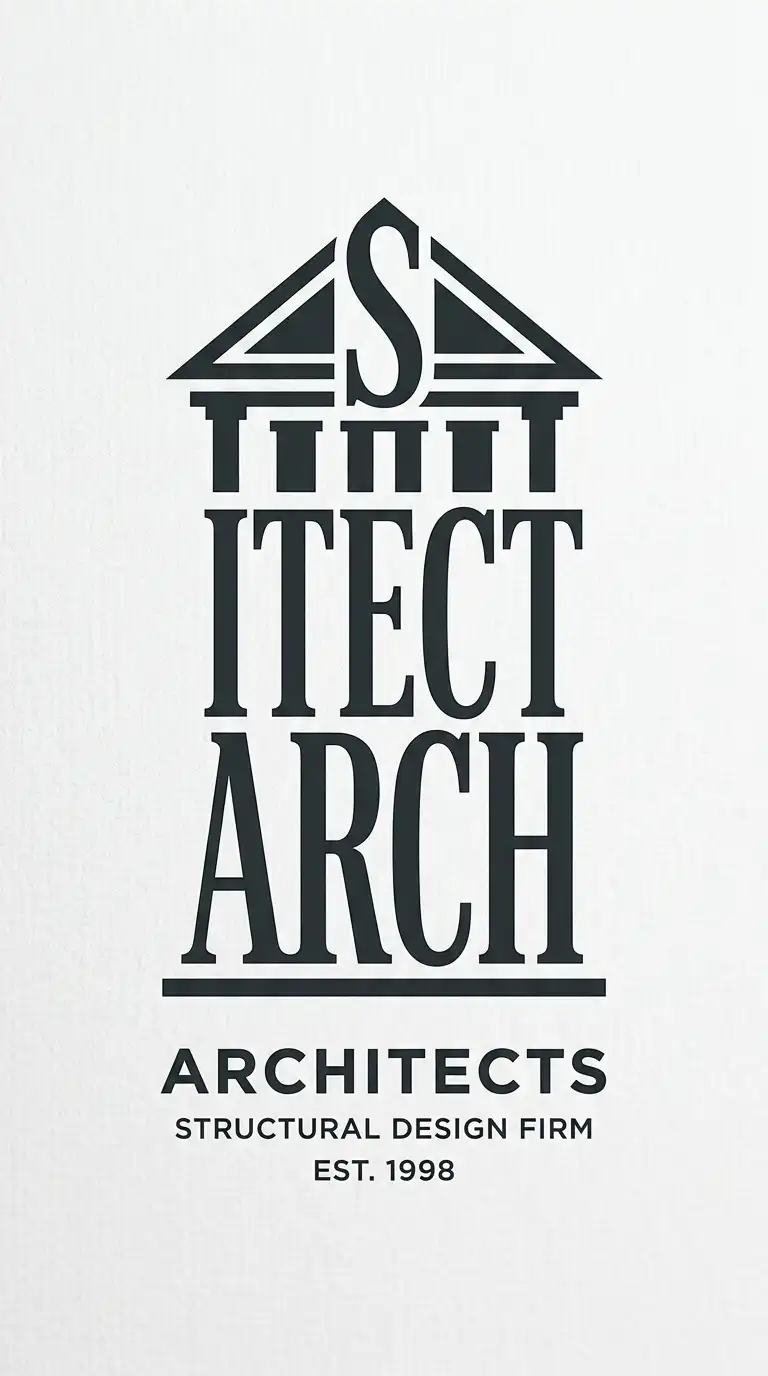
9. The Typographic Building
The typographic building logo shapes the firm’s name into a building form. The letters themselves become the columns, beams, and walls. An “A” might become a roof. An “I” might become a column. The text is the building.
This logo works for firms with short, distinctive names. The emotional effect is clever, integrated, and typographic.
Quick Tips
- Choose a font with strong vertical and horizontal strokes.
- Arrange the letters to suggest a building facade or section.
- The letters must remain readable as letters.
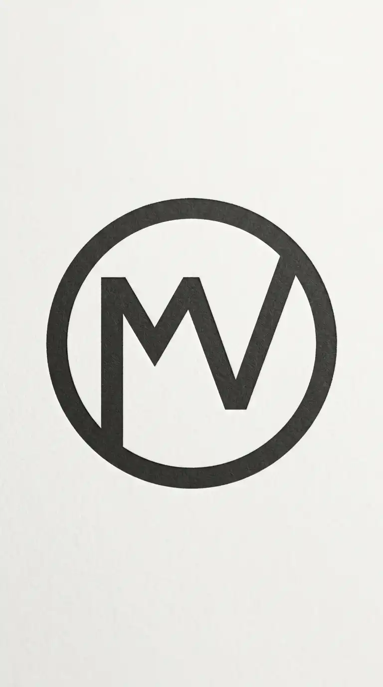
10. The Monogram
The monogram logo combines two or three letters into a single mark. The letters overlap, intersect, or share strokes. The monogram can be enclosed in a geometric shape or left open.
This logo works for firms with two or three initials. The emotional effect is classic, personal, and memorable.
Quick Tips
- Choose letters with complementary shapes.
- Overlap or intersect the letters.
- Keep the monogram simple enough to read at small sizes.
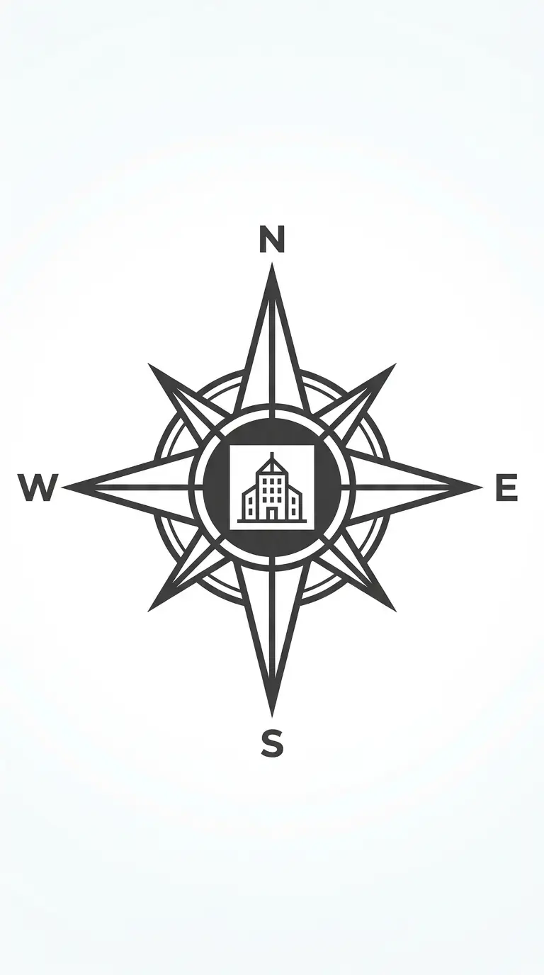
11. The Compass Rose
The compass rose logo uses the architectural compass as the central element. The compass points north, south, east, west. The logo suggests orientation, direction, and site analysis.
This logo works for firms that emphasise context and site. The emotional effect is directional, site-specific, and classical.
Quick Tips
- The compass rose should have four or eight points.
- The centre can be a building form.
- Keep the geometry precise and symmetrical.
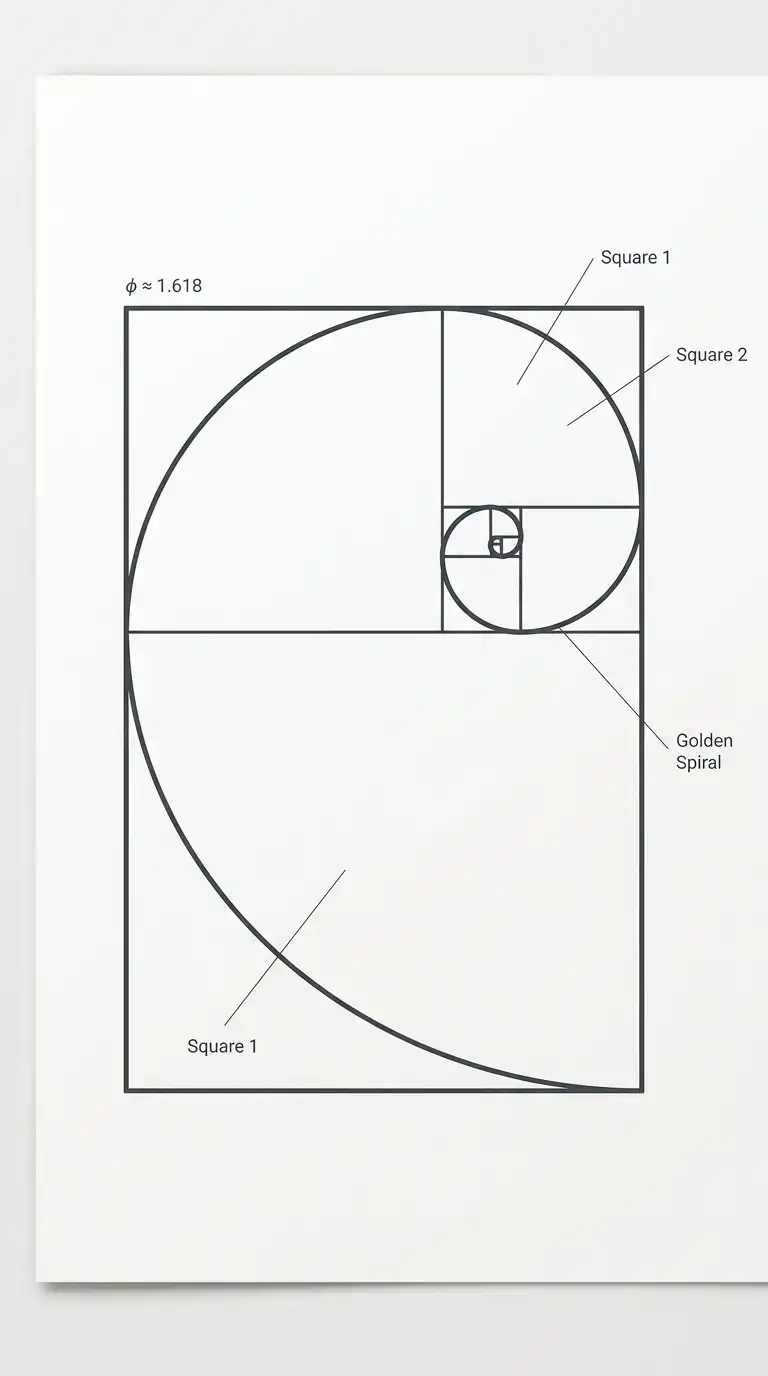
12. The Golden Rectangle
The golden rectangle logo uses the golden ratio (approximately 1:1.618) as the basis for the mark. A golden rectangle. A golden spiral. The logo suggests proportion, harmony, and classical ideals.
This logo works for firms that emphasise proportion and classical architecture. The emotional effect is harmonious, proportional, and refined.
Quick Tips
- Construct a golden rectangle using a square and a compass.
- The spiral can be a single continuous line.
- Keep the geometry mathematically precise.
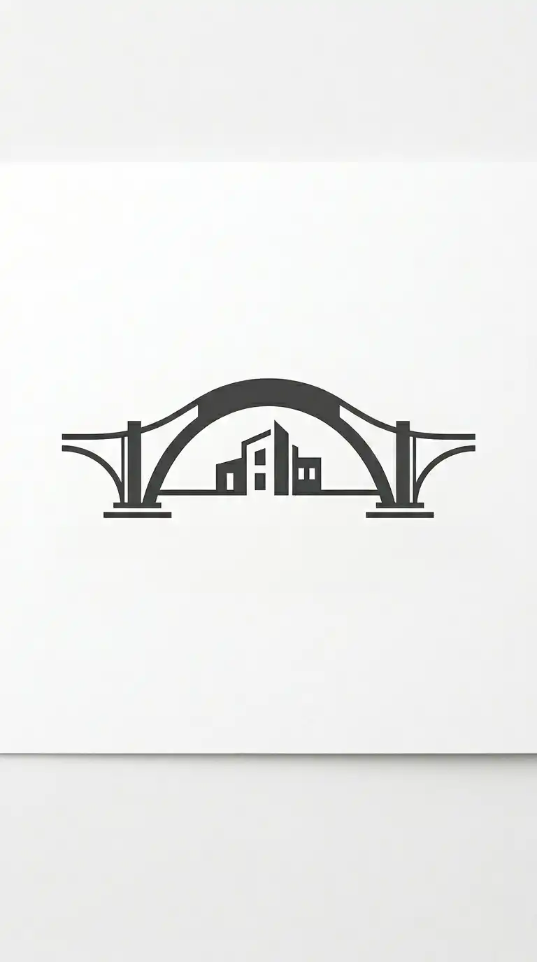
13. The Bridge Logo
The bridge logo uses a bridge as the central metaphor. The bridge connects two sides — like the firm connects client needs to design solutions. The bridge can be a single arch, a truss, or a simple horizontal line.
This logo works for firms that emphasise connection and collaboration. The emotional effect is connecting, structural, and metaphorical.
Quick Tips
- The bridge should be simple — one arch or one truss.
- The negative space under the bridge can be a building form.
- Keep the form horizontal and stable.
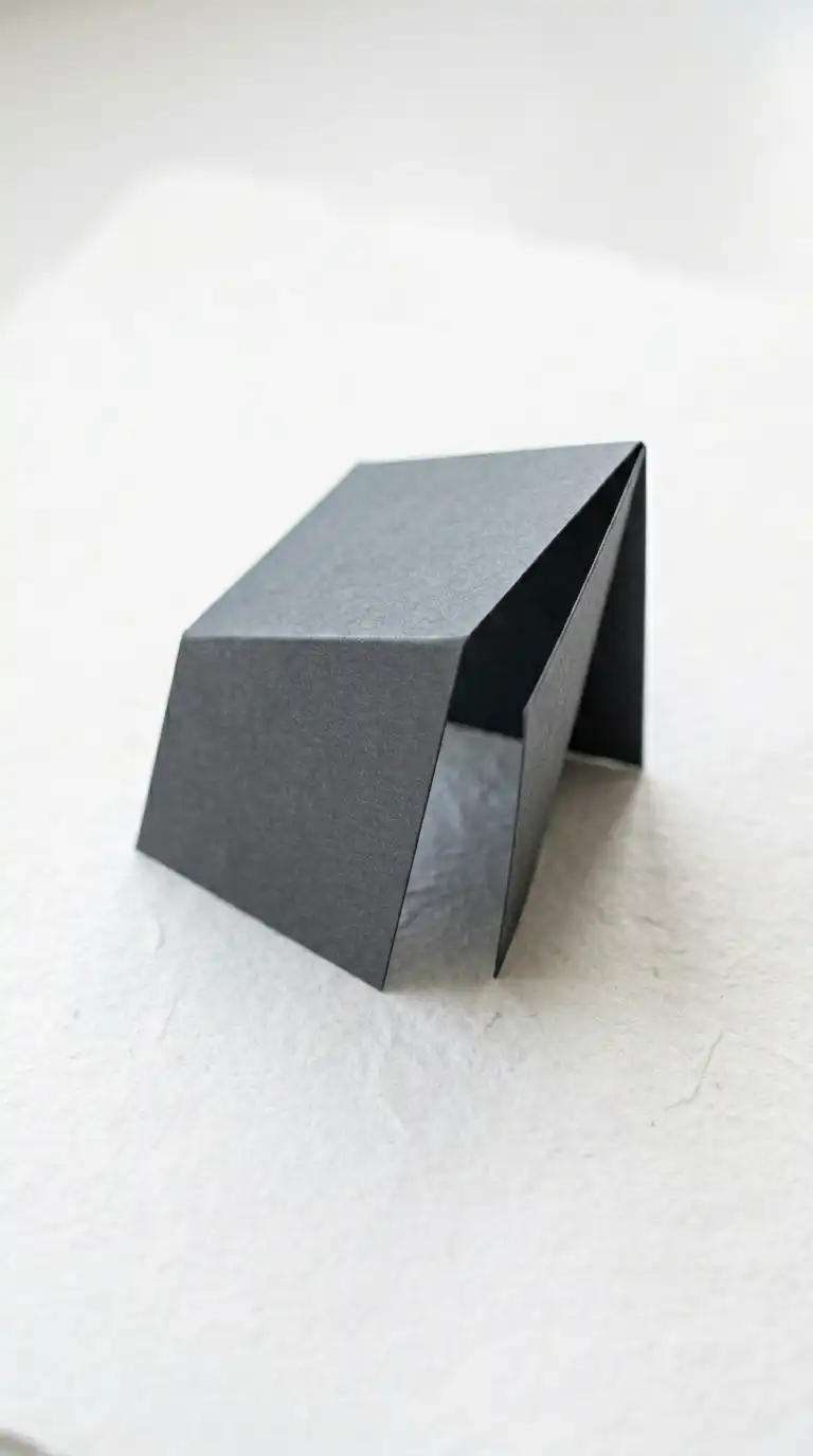
14. The Folded Paper Logo
The folded paper logo suggests a piece of paper folded into a three-dimensional form. The folds create planes that suggest walls, roofs, and floors. The logo is about transformation from flat to spatial.
This logo works for firms that emphasise form-making and modelling. The emotional effect is spatial, folded, and origami-like.
Quick Tips
- Use three or four flat planes that meet at edges.
- Shade each plane differently to show direction.
- The form should read as both paper and building.
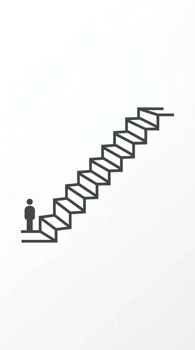
15. The Staircase Logo
The staircase logo uses a stair as the central image. The stair suggests progress, ascent, and movement through space. The stair can be a single flight, a double flight, or a spiral.
This logo works for firms that emphasise circulation and verticality. The emotional effect is ascending, progressive, and spatial.
Quick Tips
- The stair should be shown in profile or perspective.
- Use repeating horizontal and vertical lines.
- A figure can be added for scale.
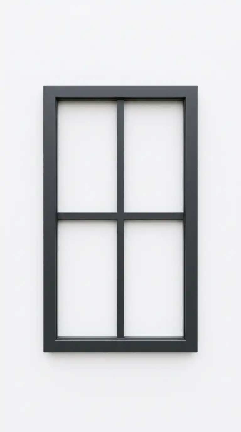
16. The Window Logo
The window logo uses a window as the central image. The window suggests view, light, and the relationship between inside and outside. The window can be a simple rectangle with mullions, or an abstract opening.
This logo works for firms that emphasise light and view. The emotional effect is opening, transparent, and luminous.
Quick Tips
- The window should have a frame and mullions.
- The negative space inside the window can be a landscape or sky.
- Keep the proportions tall and vertical.
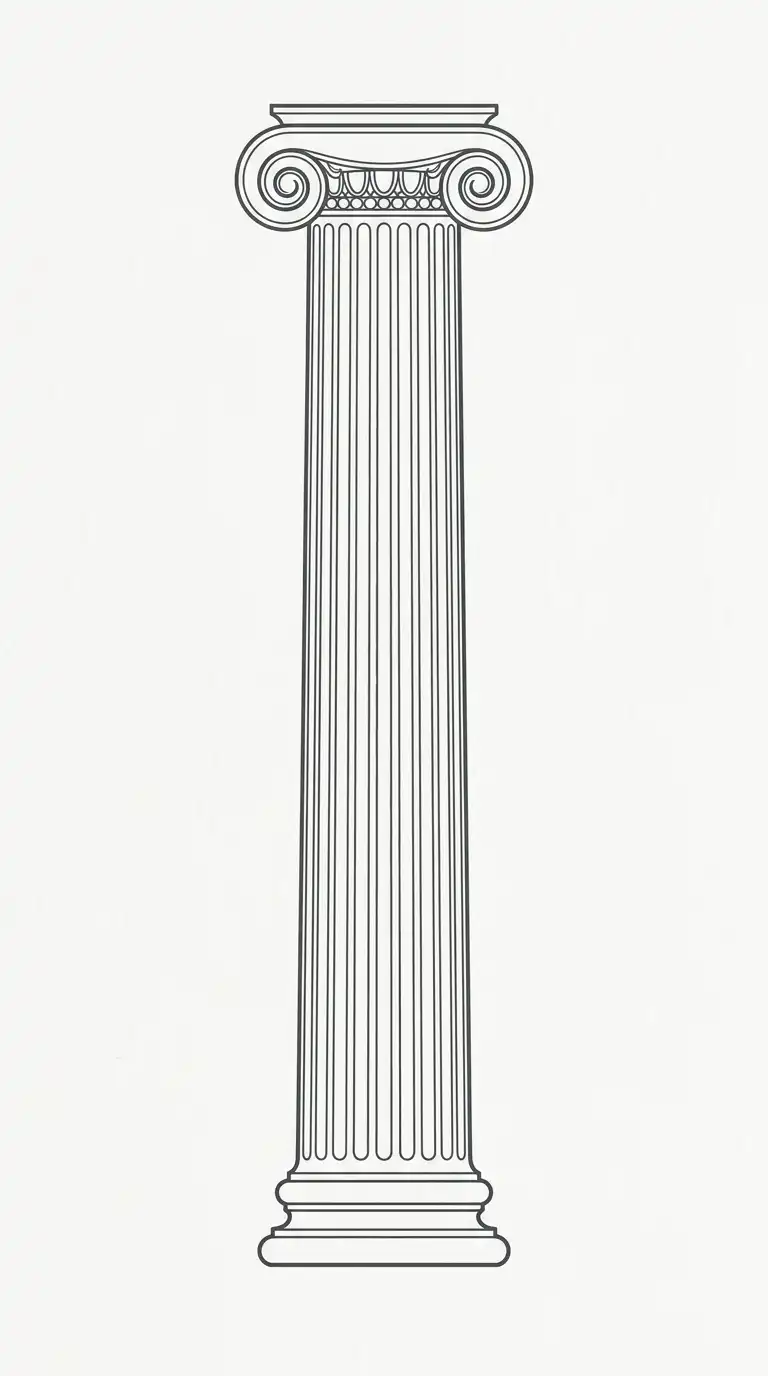
17. The Column Logo
The column logo uses a column as the central image. The column suggests structure, support, and classical order. The column can be Doric, Ionic, Corinthian, or abstract.
This logo works for firms that emphasise structure and tradition. The emotional effect is structural, supportive, and classical.
Quick Tips
- The column should have a base, shaft, and capital.
- Use vertical fluting on the shaft.
- Keep the form tall and vertical.
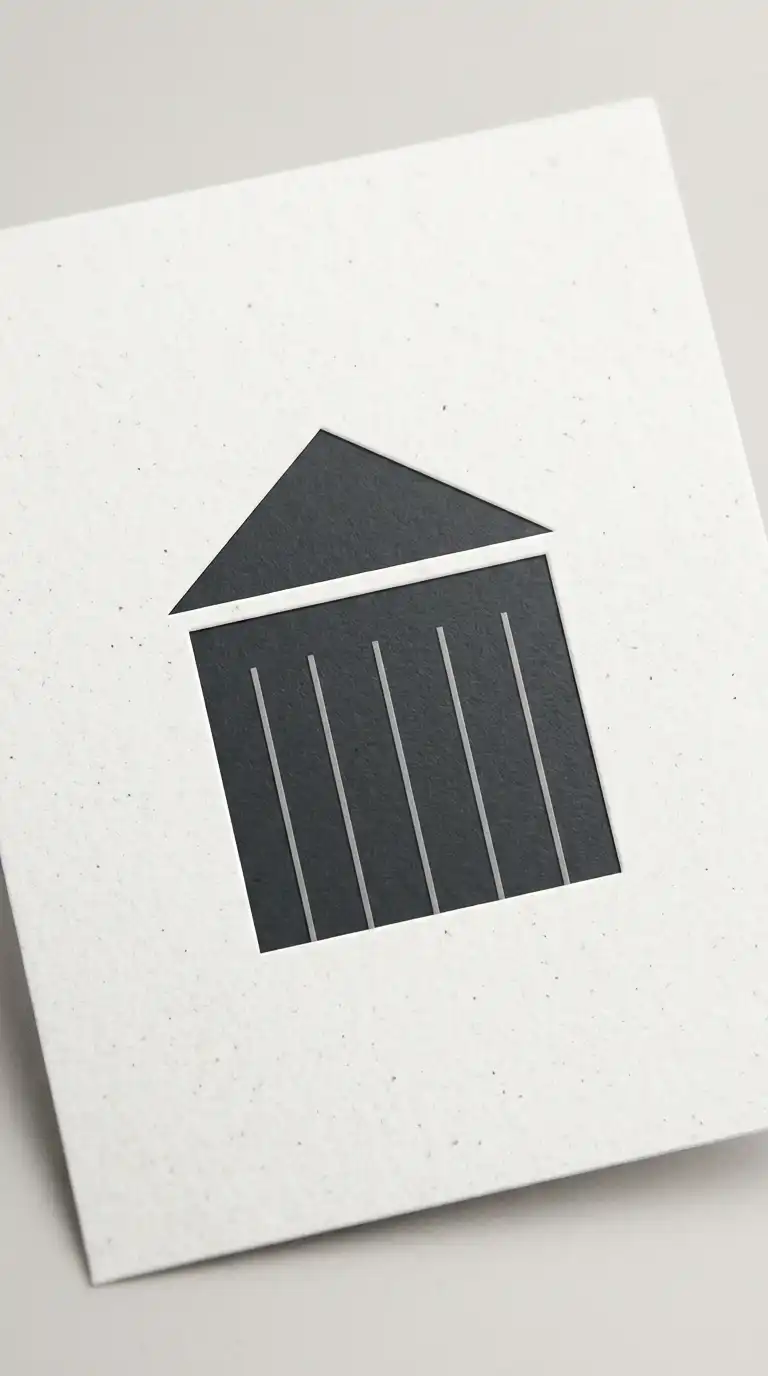
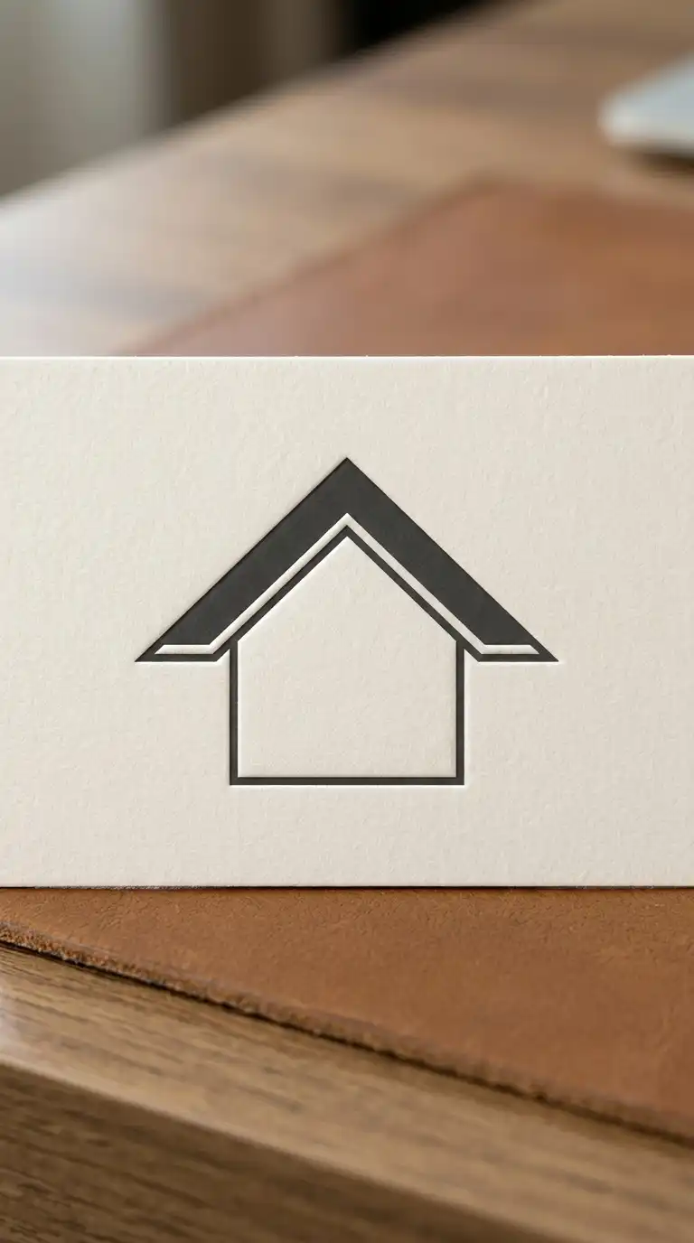
18. The Roof Logo
The roof logo uses a roof as the central image. The roof suggests shelter, protection, and home. The roof can be a simple triangle, a gable, or a more complex form.
This logo works for residential firms. The emotional effect is sheltering, domestic, and protective.
Quick Tips
- The roof should be a simple triangle or gable.
- The space under the roof can contain a building form.
- Keep the form horizontal and stable.
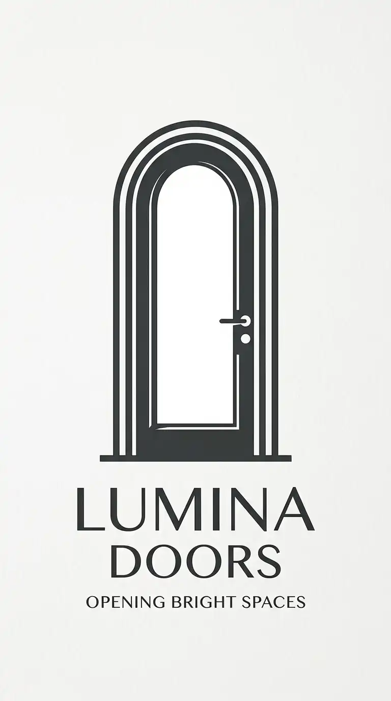
19. The Door Logo
The door logo uses a door as the central image. The door suggests entrance, threshold, and invitation. The door can be a simple rectangle, an arched opening, or a pair of doors.
This logo works for firms that emphasise entry and welcome. The emotional effect is inviting, threshold, and open.
Quick Tips
- The door should be tall and vertical.
- An arched top is more distinctive than a rectangle.
- The negative space inside the door can suggest a view.
20. The Ellipse Logo
The ellipse logo uses an ellipse or oval as the central form. The ellipse suggests a domed building, an arena, or a courtyard. The ellipse is dynamic and directional.
This logo works for firms that specialise in public buildings. The emotional effect is dynamic, curved, and public.
Quick Tips
- The ellipse should be drawn accurately with two axes.
- A building form can be inside or outside the ellipse.
- Keep the form simple and uncluttered.
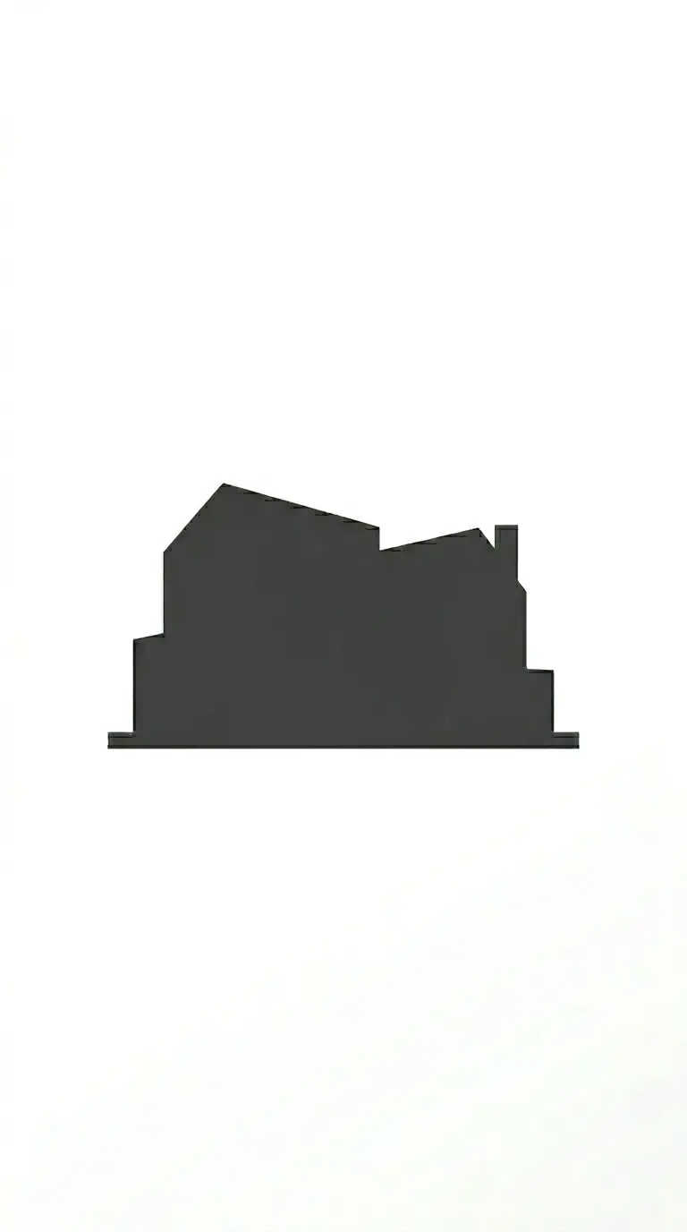
21. The Silhouette Logo
The silhouette logo uses a solid dark silhouette of a building or city skyline. The silhouette is abstracted and simplified. There are no interior lines — only the outline matters.
This logo works for firms that want a bold, graphic mark. The emotional effect is bold, graphic, and iconic.
Quick Tips
- The silhouette should be simplified to a few shapes.
- Use a single solid dark shape — no interior lines.
- The silhouette should be recognisable as architecture.
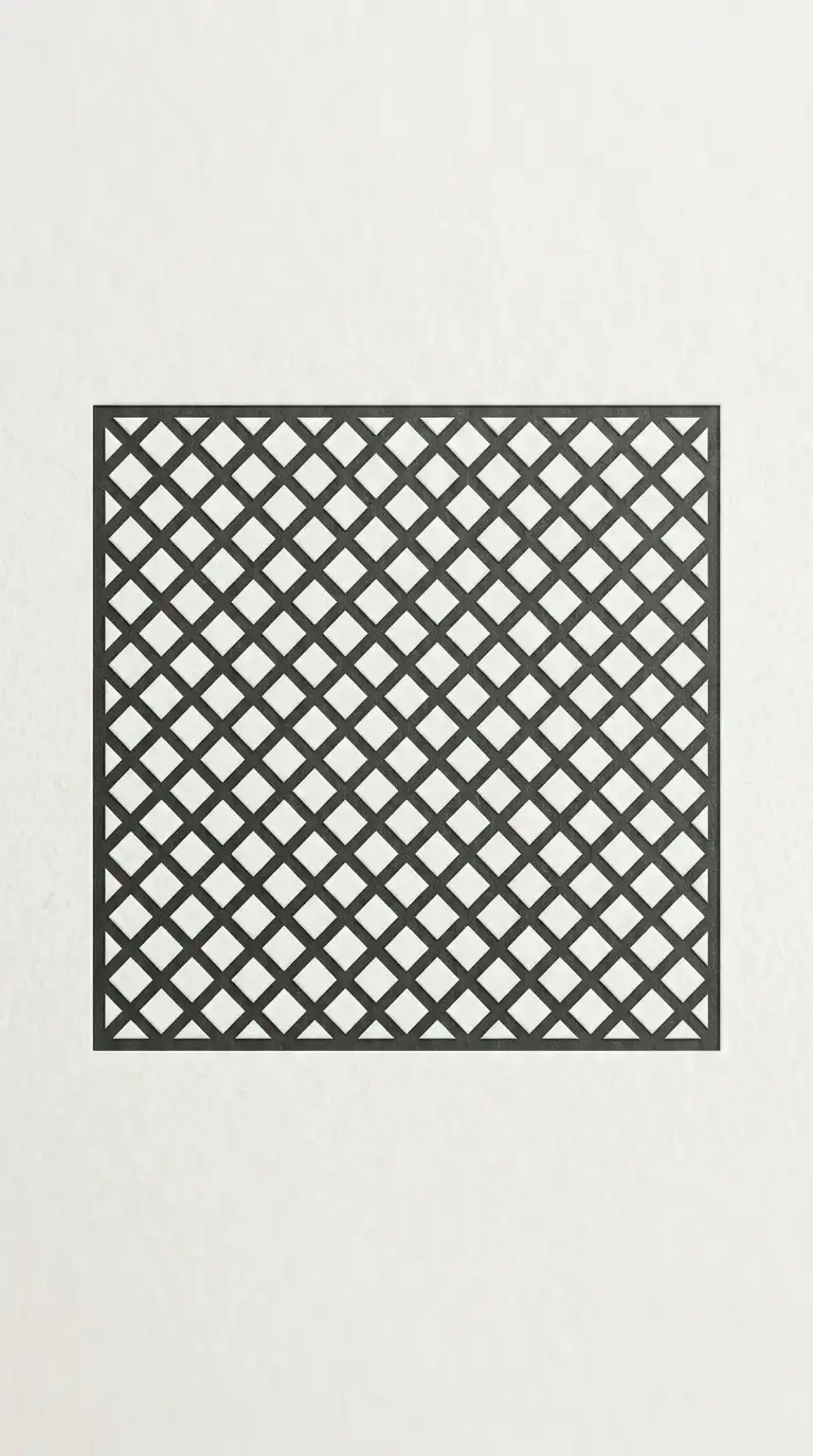
22. The Lattice Logo
The lattice logo uses a diagonal grid or lattice pattern. The lattice suggests structure, screening, and light filtration. The lattice can be a complete grid or a fragment.
This logo works for firms that emphasise facade design and materiality. The emotional effect is patterned, structural, and light.
Quick Tips
- Use a diagonal grid (45 degrees is standard).
- The grid should be regular and consistent.
- A building form can be implied by cropping the grid.
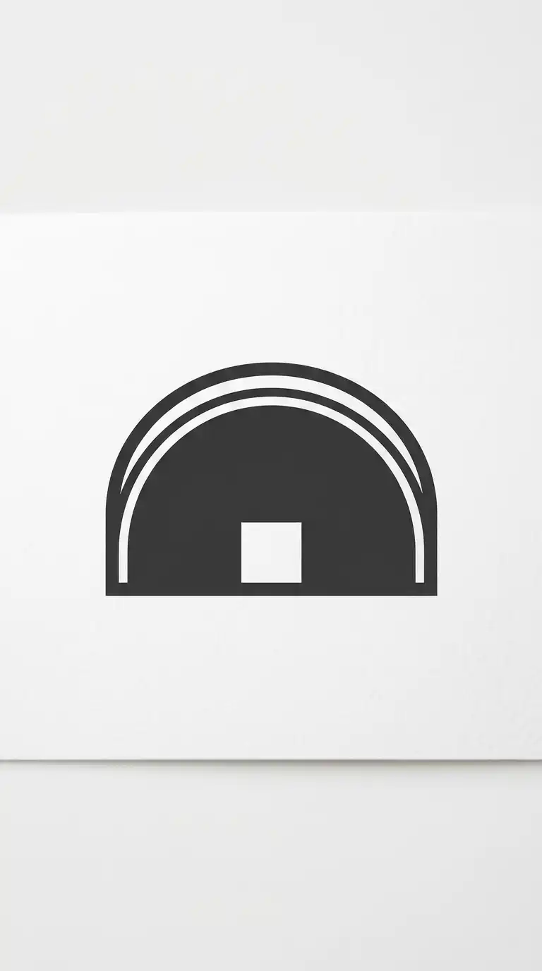
23. The Arch Logo
The arch logo uses an arch as the central image. The arch is the most fundamental architectural form — structure and opening combined. The arch can be a single semicircle, a pointed arch, or a series of arches.
This logo works for firms that emphasise structure and history. The emotional effect is structural, classical, and opening.
Quick Tips
- The arch must be a true semicircle or pointed arch.
- The space under the arch can contain a building form.
- Keep the form simple and monumental.
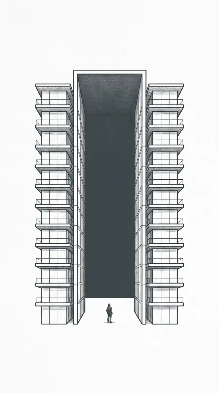
24. The Atrium Logo
The atrium logo uses a section through a building with a central atrium. The logo shows floors on both sides of a central void. The atrium suggests light, vertical connection, and interior space.
This logo works for firms that emphasise interior space and light. The emotional effect is vertical, luminous, and spatial.
Quick Tips
- Show three or four floors on both sides of a central void.
- The atrium should be the widest element.
- A figure can be added for scale.