An architecture portfolio is not a collection of drawings. It is a designed object. The layout of each page determines how the work is read, understood, and remembered. A good layout guides the eye, establishes hierarchy, and makes complex information clear. A bad layout confuses, clutters, and distracts.
These 12 architecture portfolio layout ideas span page structures, grid systems, and typographic strategies. Each idea includes defining characteristics, layout principles, and applications.
1. The Single-Image Page Layout
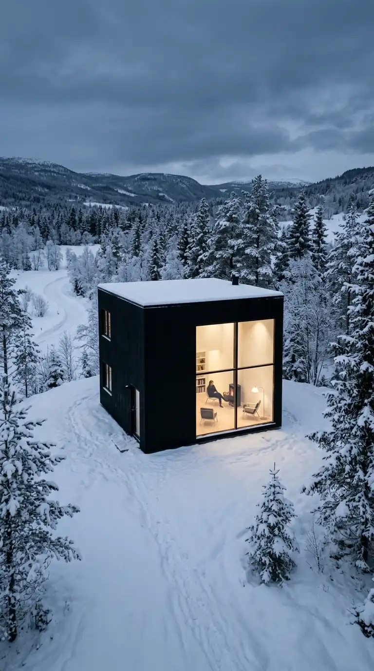
The single-image page layout places one image on a page. The image is large, often full-page or nearly full-page. The text is minimal — a title, a caption, a date. The single-image layout is dramatic, confident, and image-focused.
This layout is ideal for hero images, final renderings, and photographs. The emotional effect is dramatic, confident, and image-focused.
Quick Tips
- The image must be strong enough to stand alone.
- Text must be minimal (title, caption, date).
- White space is essential.
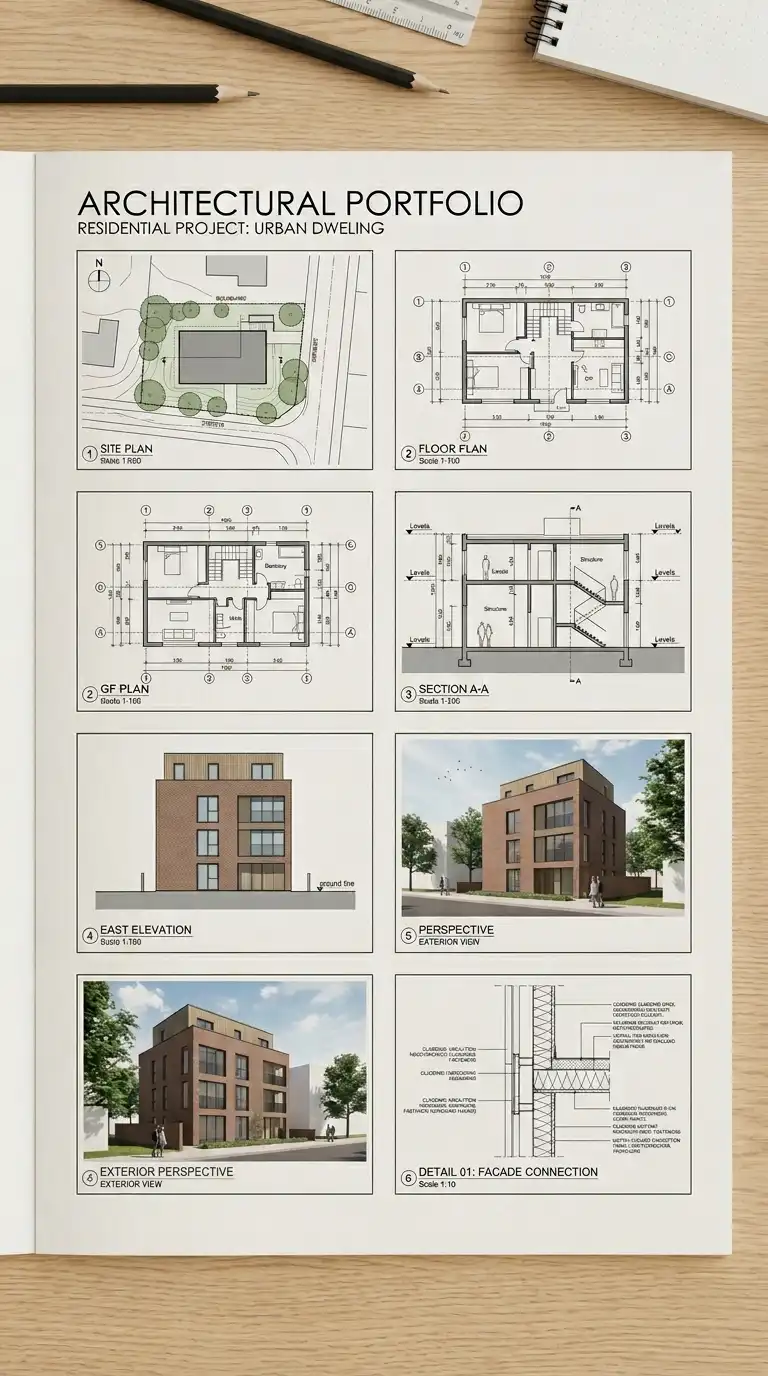
2. The Grid Layout
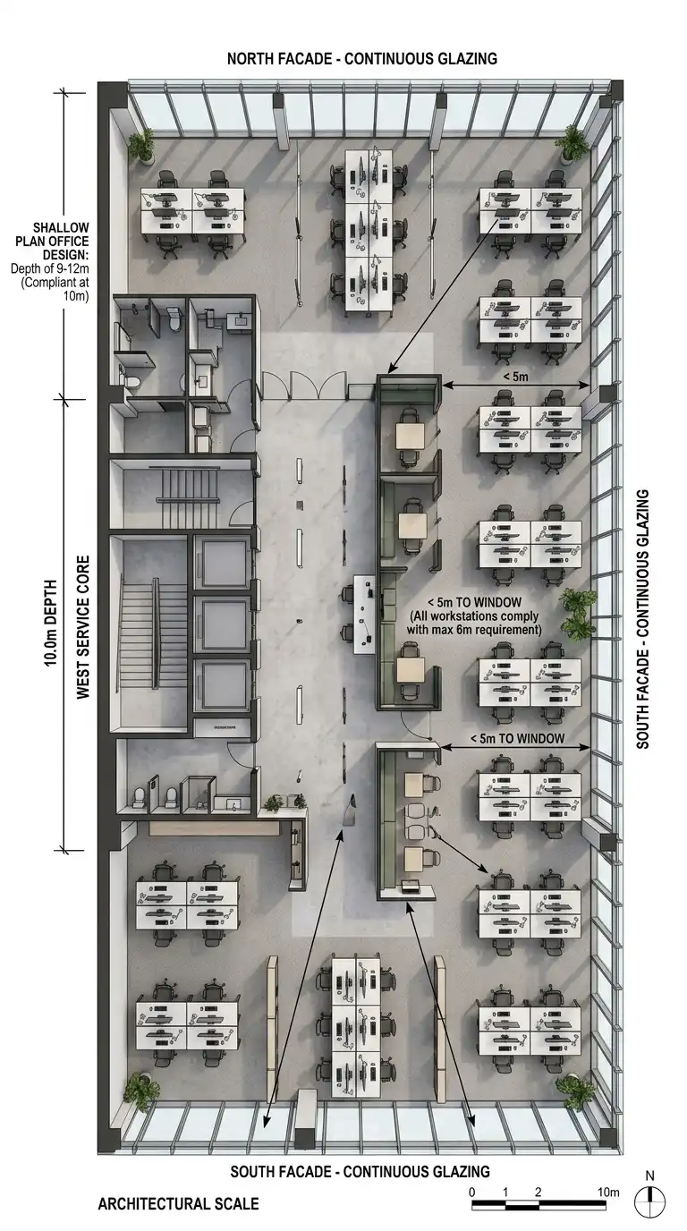
The grid layout organises images in a regular grid of rows and columns. The grid can be 2×2, 3×2, 3×3, or any combination. All images are the same size. The grid is strict and consistent. The grid layout is rational, efficient, and orderly.
This layout is ideal for portfolios with many similar images (plans, sections, details). The emotional effect is rational, efficient, and orderly.
Quick Tips
- Choose a grid (2×2, 3×2, 3×3) and stick to it.
- Leave consistent gaps between images.
- Crop all images to the same aspect ratio.
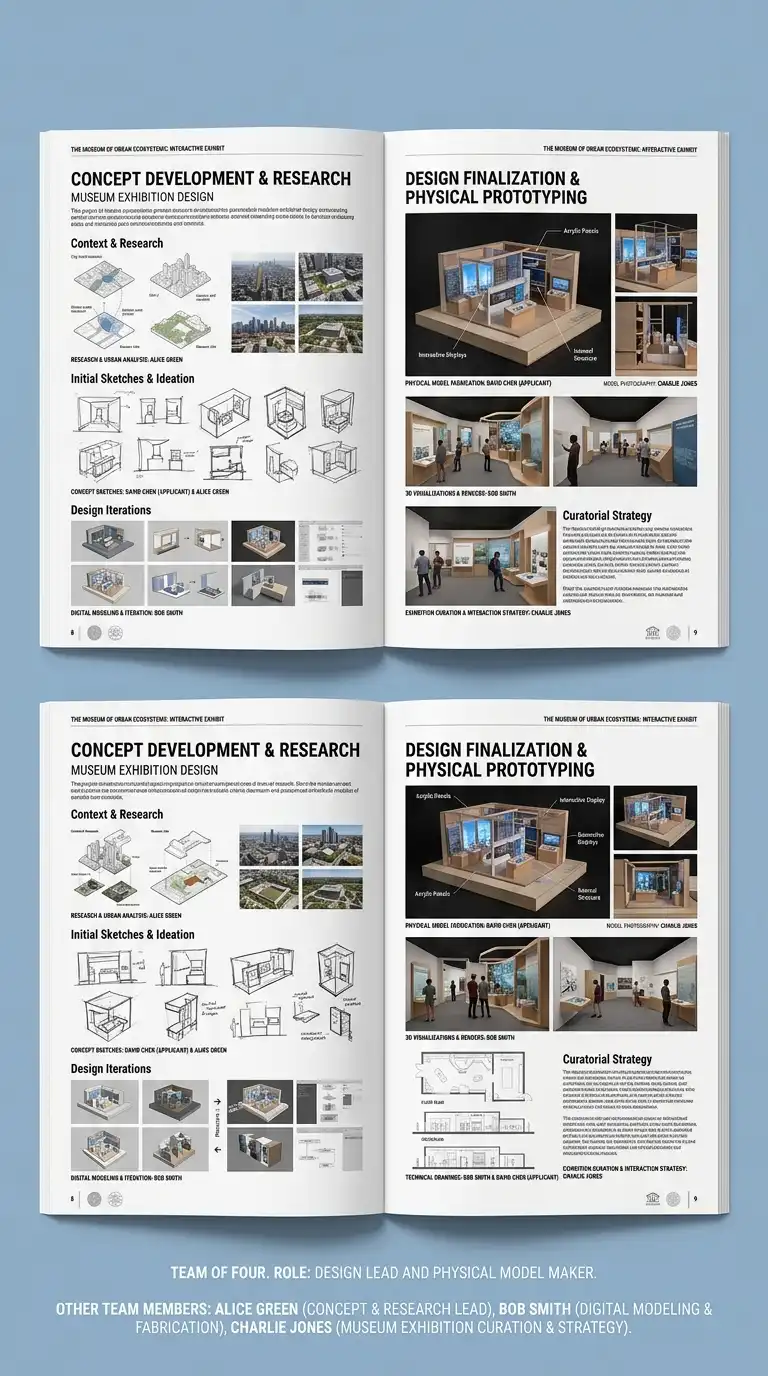
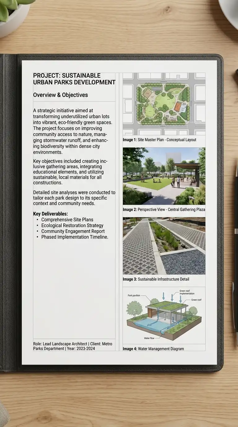
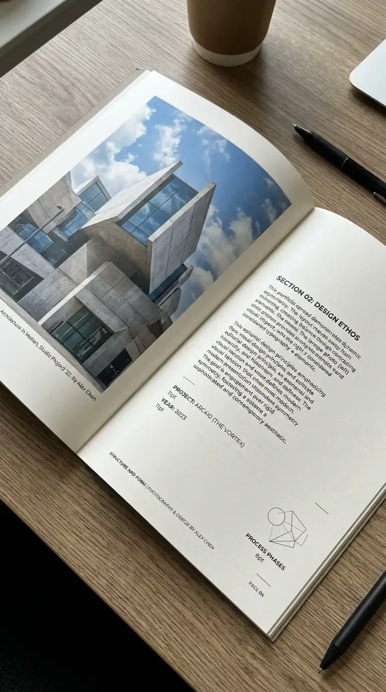
3. The Two-Column Layout
The two-column layout splits the page into two vertical columns. Text in one column, images in the other. Or both columns have text and images. The two-column layout is efficient and versatile. It is ideal for portfolios with a mix of text and images.
This layout is ideal for project descriptions, process work, and case studies. The emotional effect is efficient, balanced, and versatile.
Quick Tips
- Keep columns equal width or one wider than the other.
- Align elements to the column grid.
- Use a visible or invisible grid.
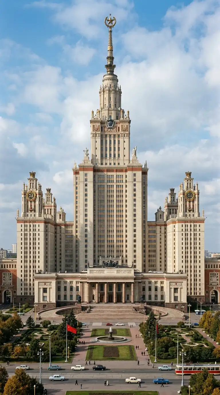
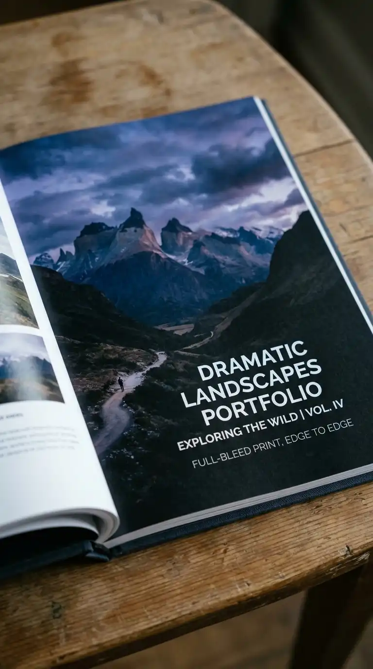
4. The Full-Bleed Layout
The full-bleed layout prints images edge to edge, with no margins. The image fills the entire page. Text is overlaid on the image. The full-bleed layout is dramatic, immersive, and bold.
This layout is ideal for hero images, photography, and final renderings. The emotional effect is dramatic, immersive, and bold.
Quick Tips
- Images must be high resolution (300dpi at final size).
- Place text where it contrasts with the image.
- Critical content must be away from the trim line (at least 1cm).
5. The Asymmetrical Layout
The asymmetrical layout is not balanced on a centre line. One side has a large image. The other side has small text. The asymmetrical layout is dynamic and modern. It uses visual weight, not symmetry, to balance the page.
This layout is ideal for creative portfolios and contemporary work. The emotional effect is dynamic, modern, and unexpected.
Quick Tips
- Use visual weight to balance the page.
- Avoid mirroring elements.
- The layout must feel intentional, not random.
6. The Diagonal Layout
The diagonal layout organises elements along a diagonal axis. Images and text are placed on a diagonal line from top-left to bottom-right or top-right to bottom-left. The diagonal layout is dynamic and unexpected.
This layout is ideal for creative portfolios and experimental work. The emotional effect is dynamic, diagonal, and unexpected.
Quick Tips
- Establish a diagonal axis first.
- Place elements along the axis.
- Leave empty space on the opposite diagonal.
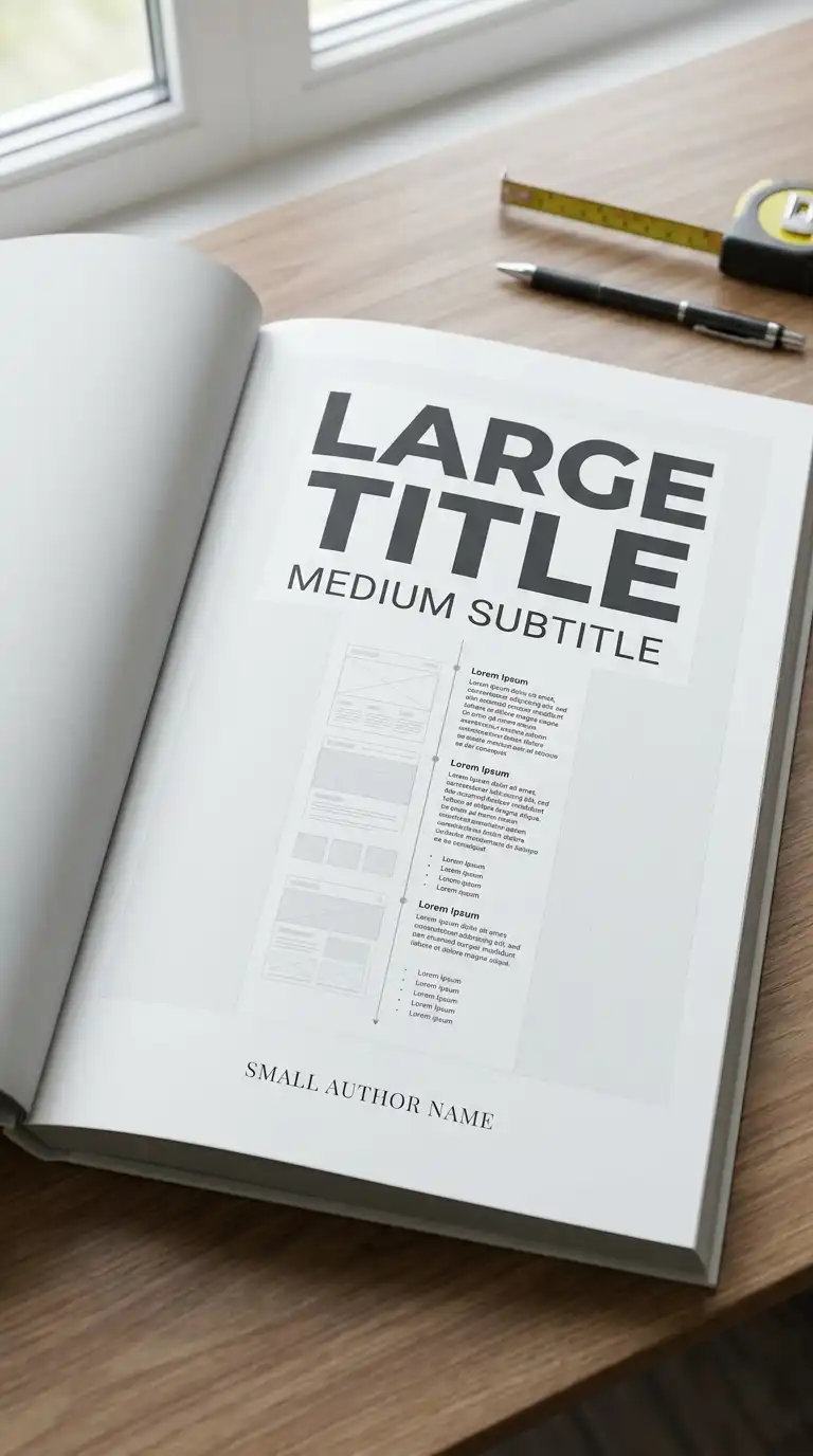
7. The Hierarchical Layout
The hierarchical layout uses size and position to establish importance. The most important element is largest, at the top. The least important element is smallest, at the bottom. The hierarchical layout guides the eye from most important to least important.
This layout is ideal for title pages, covers, and project introductions. The emotional effect is clear, guided, and hierarchical.
Quick Tips
- The most important element must be the largest.
- The least important element must be the smallest.
- The eye should move from top to bottom, left to right.
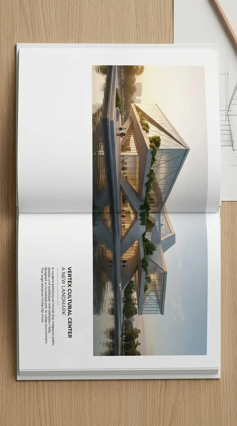
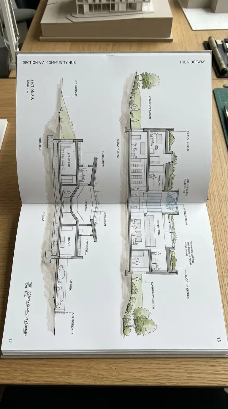
8. The Spread Layout
The spread layout treats two facing pages as one composition. An image or drawing spans across the gutter from the left page to the right page. The spread layout is dramatic and panoramic.
This layout is ideal for wide drawings (sections, elevations, panoramas) and hero images. The emotional effect is panoramic, continuous, and dramatic.
Quick Tips
- The image must span across the gutter.
- Critical content must be away from the gutter (at least 1cm).
- The spread must work as a single composition.
9. The Text-Only Page Layout
The text-only page layout has no images. Only text. A project statement, a manifesto, a list of drawings. The text-only page is calm, confident, and typographic.
This layout is ideal for introductions, project statements, and colophons. The emotional effect is calm, confident, and typographic.
Quick Tips
- Use a single typeface.
- Use hierarchy (title, subtitle, body, caption).
- Leave generous white space.
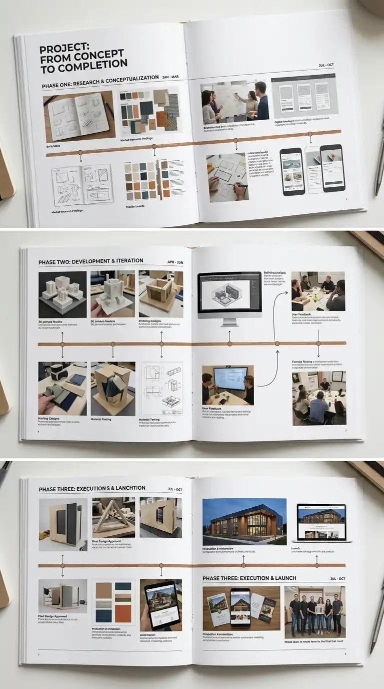
10. The Timeline Layout
The timeline layout arranges images in chronological order. The images are connected by a line (the timeline). The timeline shows the progress of a project from start to finish. The timeline layout is narrative, sequential, and process-oriented.
This layout is ideal for process work and long-term projects. The emotional effect is narrative, sequential, and process-oriented.
Quick Tips
- The timeline must be a visible line.
- Images must be in chronological order.
- Dates or phases must be labelled.
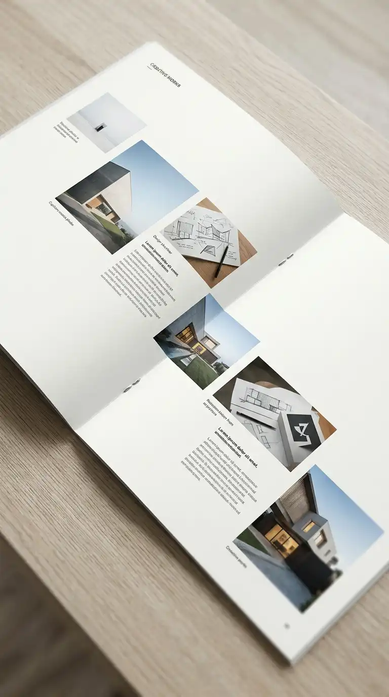
11. The Matrix Layout
The matrix layout organises images in a matrix of rows and columns, but the images are different sizes. One image is large, dominating the matrix. Other images are smaller, filling the remaining cells. The matrix layout is dynamic, varied, and hierarchical.
This layout is ideal for portfolios with a hero image and supporting images. The emotional effect is dynamic, varied, and hierarchical.
Quick Tips
- One image should dominate (2×2 or 3×2 cells).
- Other images should be smaller (1×1 cells).
- The matrix must be a regular grid of cells.
12. The Hybrid Layout
The hybrid layout combines multiple layout types in one portfolio. Some pages are single-image. Some pages are grid. Some pages are two-column. The hybrid layout is varied and flexible. It allows different pages for different content.
This layout is ideal for portfolios with diverse content (plans, renderings, photographs, text). The emotional effect is varied, flexible, and appropriate.
Quick Tips
- Use different layouts for different content types.
- Maintain a consistent typographic voice.
- Use a consistent colour palette.
Final Thoughts
These 12 layout ideas are not mutually exclusive. A grid layout can be asymmetrical. A spread layout can be full-bleed. A hybrid layout can combine single-image, grid, and two-column. The best portfolio layouts are not the most complex — they are the most appropriate. They fit the work, the audience, and the architect. They are not just containers — they are arguments. They are the difference between a portfolio that is looked at and a portfolio that is remembered.