An architecture background is the visual context behind a drawing, rendering, or presentation board. It is not the subject — it is what the subject sits against. A good background enhances the subject without competing with it. A bad background distracts, clutters, and confuses. The best backgrounds are simple, atmospheric, and architectural.
These 12 architecture background ideas span digital and analogue, abstract and representational. Each idea includes defining characteristics, applications, and design principles.
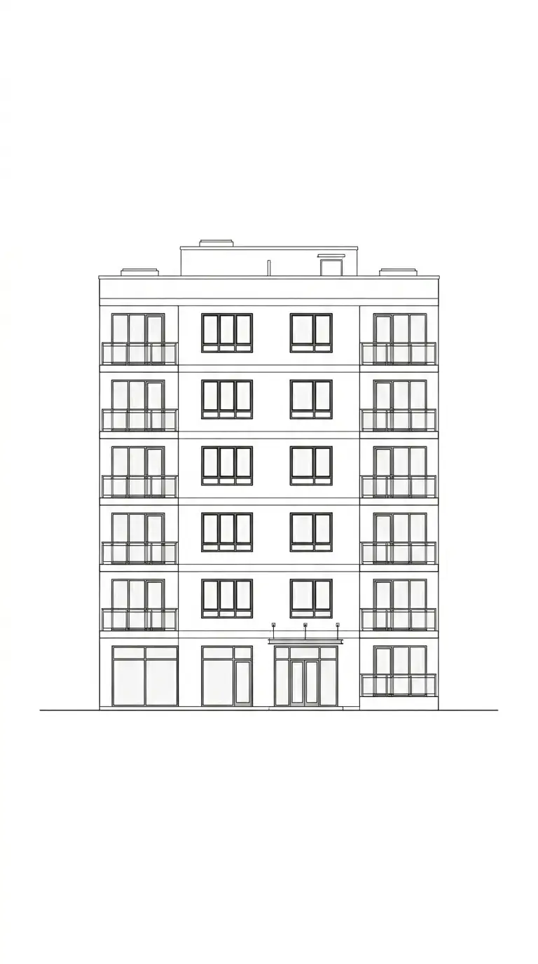
1. The White Background
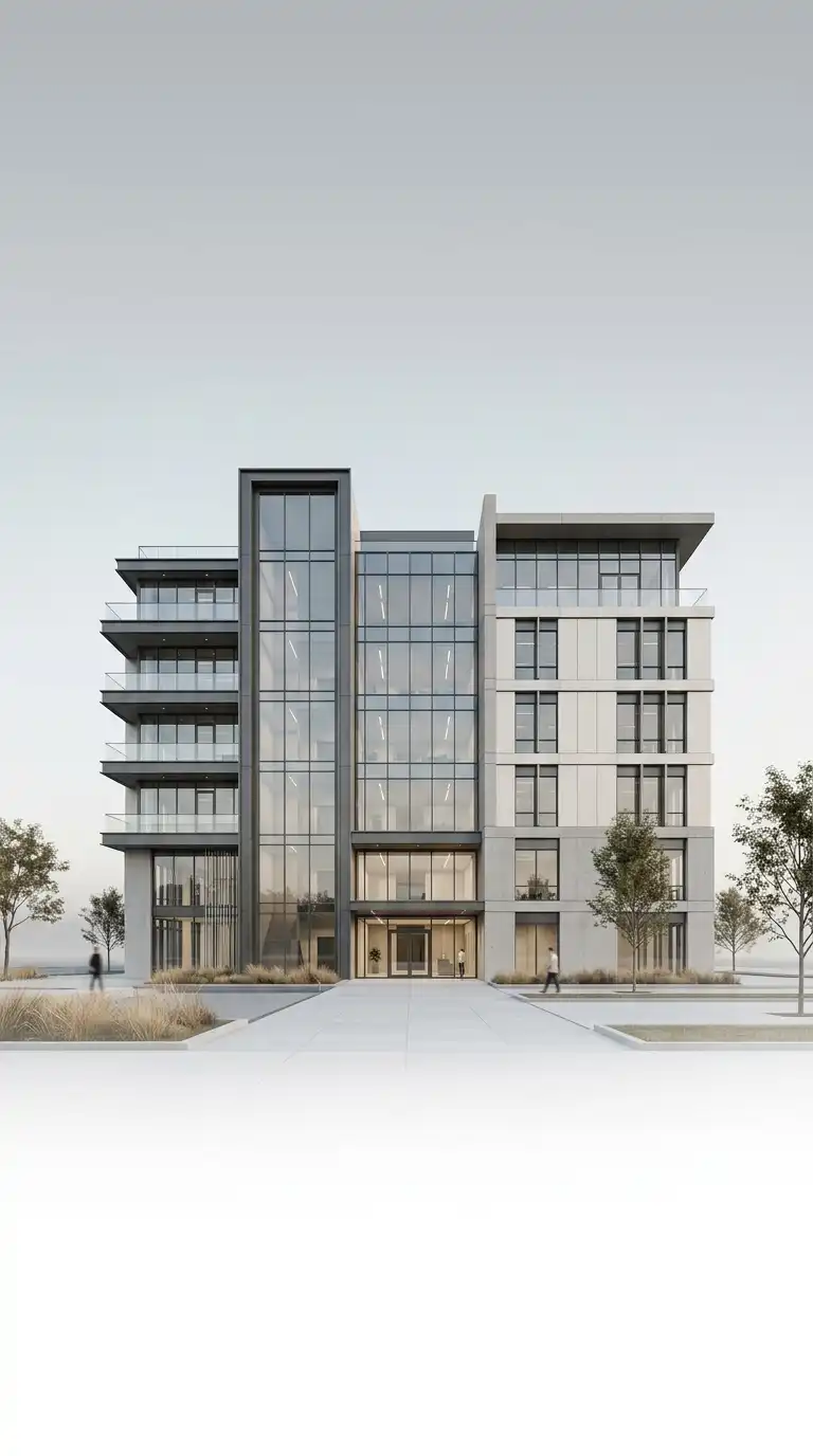
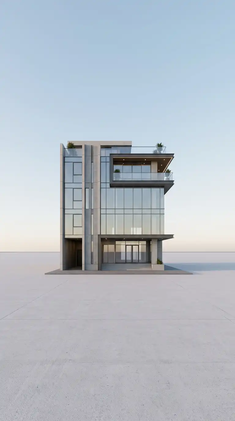
The white background is the simplest and most common architecture background. The subject sits on a pure white field. No shadows, no gradients, no textures. The white background forces the viewer to focus entirely on the building.
This background is ideal for technical drawings, plans, sections, and elevations. The emotional effect is clean, precise, and neutral.
Quick Tips
- The white must be pure — no off-white, no cream.
- No shadows on the background.
- The subject must be sharply defined against the white.
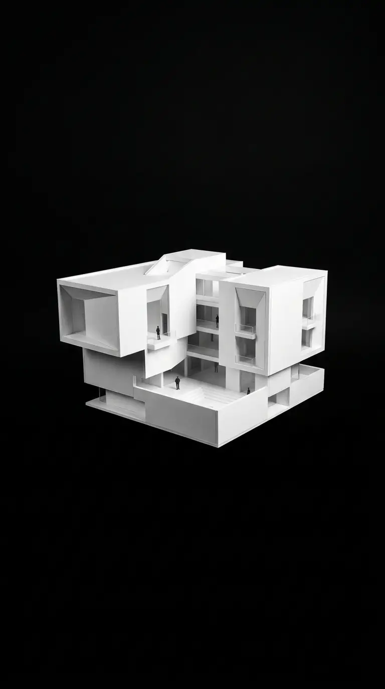
2. The Black Background
The black background reverses the usual relationship of figure and ground. The subject sits on a pure black field. The building is often white or light-coloured. The black background is dramatic and nocturnal.
This background is ideal for night scenes, dramatic presentations, and white models. The emotional effect is dramatic, nocturnal, and graphic.
Quick Tips
- The black must be pure — no grey, no gradients.
- The subject should be light-coloured (white, light grey, or glowing).
- Use for night scenes or dramatic effects.
3. The Gradient Background
The gradient background transitions smoothly from one colour to another. The gradient is usually subtle — light grey to white, pale blue to white, or warm grey to cream. The gradient adds depth without distraction.
This background is ideal for renderings and perspectives. The emotional effect is subtle, deep, and atmospheric.
Quick Tips
- The gradient should be subtle — low contrast.
- The lightest part of the gradient should be behind the subject.
- Avoid bright or saturated colours.
4. The Atmospheric Sky Background
The atmospheric sky background places the building against a sky — cloudy, sunset, or dawn. The sky is soft and atmospheric, not competing with the building. The building is silhouetted or rendered with matching light.
This background is ideal for exterior perspectives and hero images. The emotional effect is atmospheric, dramatic, and beautiful.
Quick Tips
- The sky should be soft — no harsh colours.
- The building’s lighting must match the sky.
- The sky should not compete with the building.
5. The Ground Plane Background
The ground plane background places the building on a simple ground plane — a horizon line, a shadow, and a gradient sky. The ground plane gives the building a place to stand without adding detail. The background is minimal but spatial.
This background is ideal for exterior perspectives and massing studies. The emotional effect is grounded, spatial, and minimal.
Quick Tips
- The ground plane should be a simple horizontal line.
- Add a soft shadow directly under the building.
- The sky should be a subtle gradient.
6. The Grid Background
The grid background places the subject on a field of grid lines. The grid can be square, isometric, or axonometric. The grid provides scale and structure. The grid is usually light grey or blue, drawn in thin lines.
This background is ideal for diagrams, plans, and technical drawings. The emotional effect is technical, structured, and scaled.
Quick Tips
- Use thin, light lines (0.25pt or 0.5pt).
- The grid should be light grey or pale blue — not black.
- The subject should be darker than the grid.
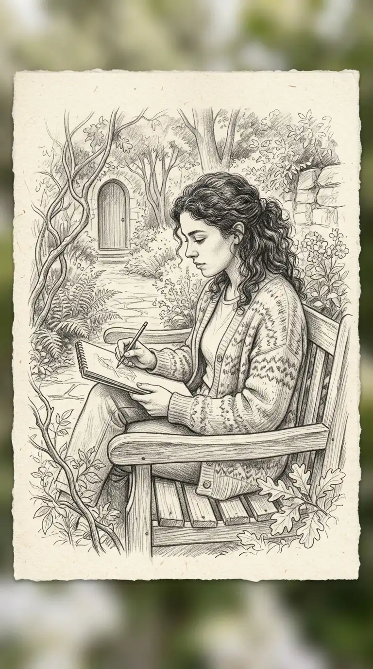
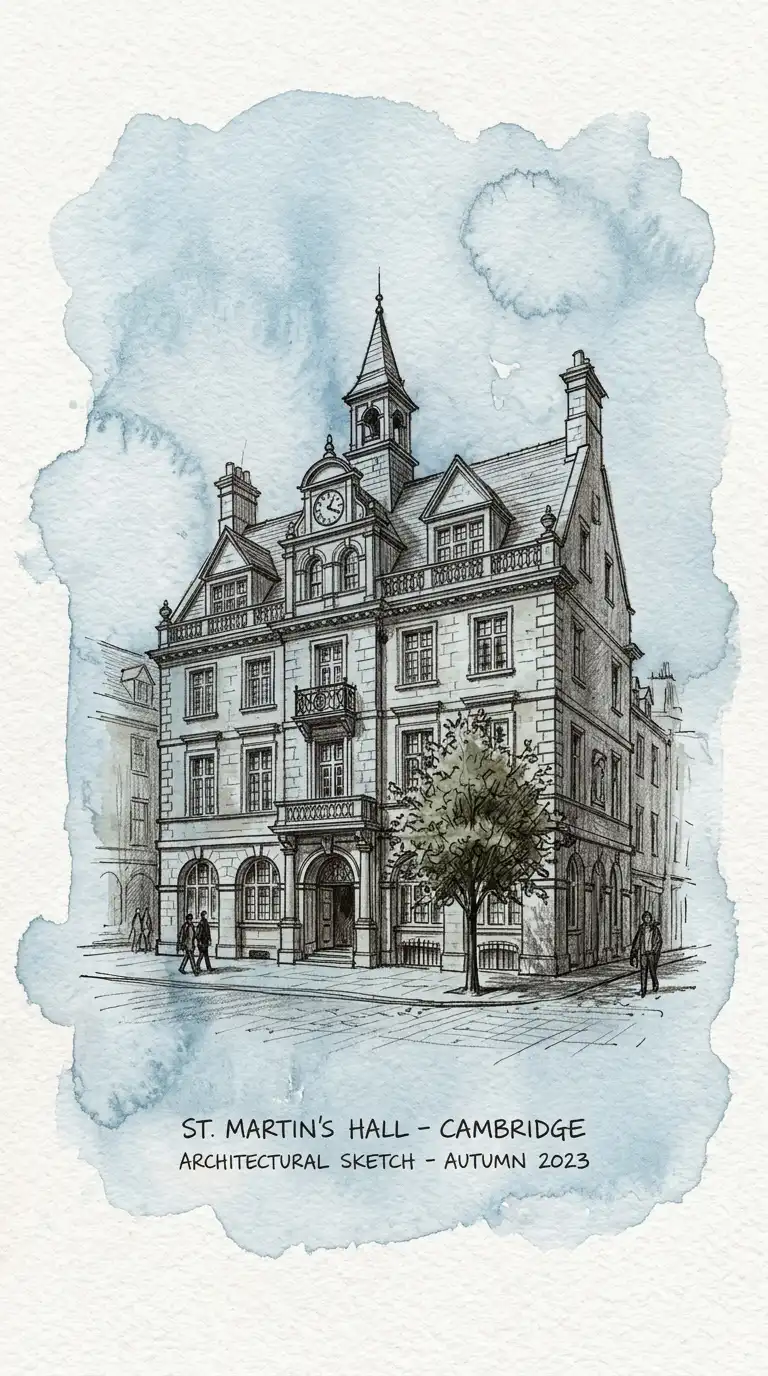
7. The Paper Texture Background
The paper texture background simulates or uses actual paper texture. The background is not perfectly smooth — it has grain, tooth, or fibres. The paper texture adds warmth and tactility.
This background is ideal for hand-drawn work, sketches, and traditional presentations. The emotional effect is warm, tactile, and handmade.
Quick Tips
- Use a high-resolution scan of actual paper.
- The texture should be subtle — not overwhelming.
- The subject should be drawn or printed on the paper.
8. The Watercolour Wash Background
The watercolour wash background is a soft, abstract wash of colour. The wash is irregular, with blooms and edges. The colour is pale and muted. The wash is clearly background, not subject.
This background is ideal for artistic presentations and hand-drawn work. The emotional effect is artistic, soft, and expressive.
Quick Tips
- Use pale, muted colours — pale blue, warm grey, cream.
- The wash should be irregular — no hard edges.
- The subject should be darker than the wash.
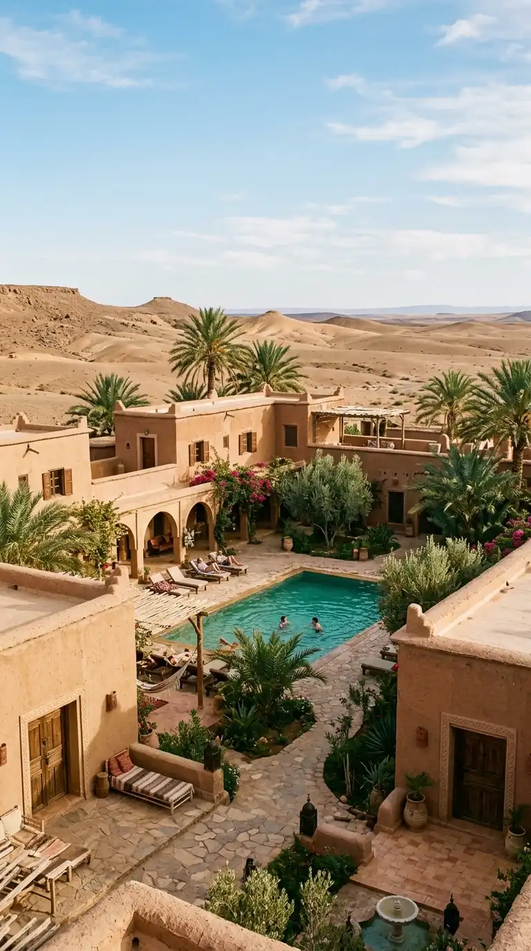
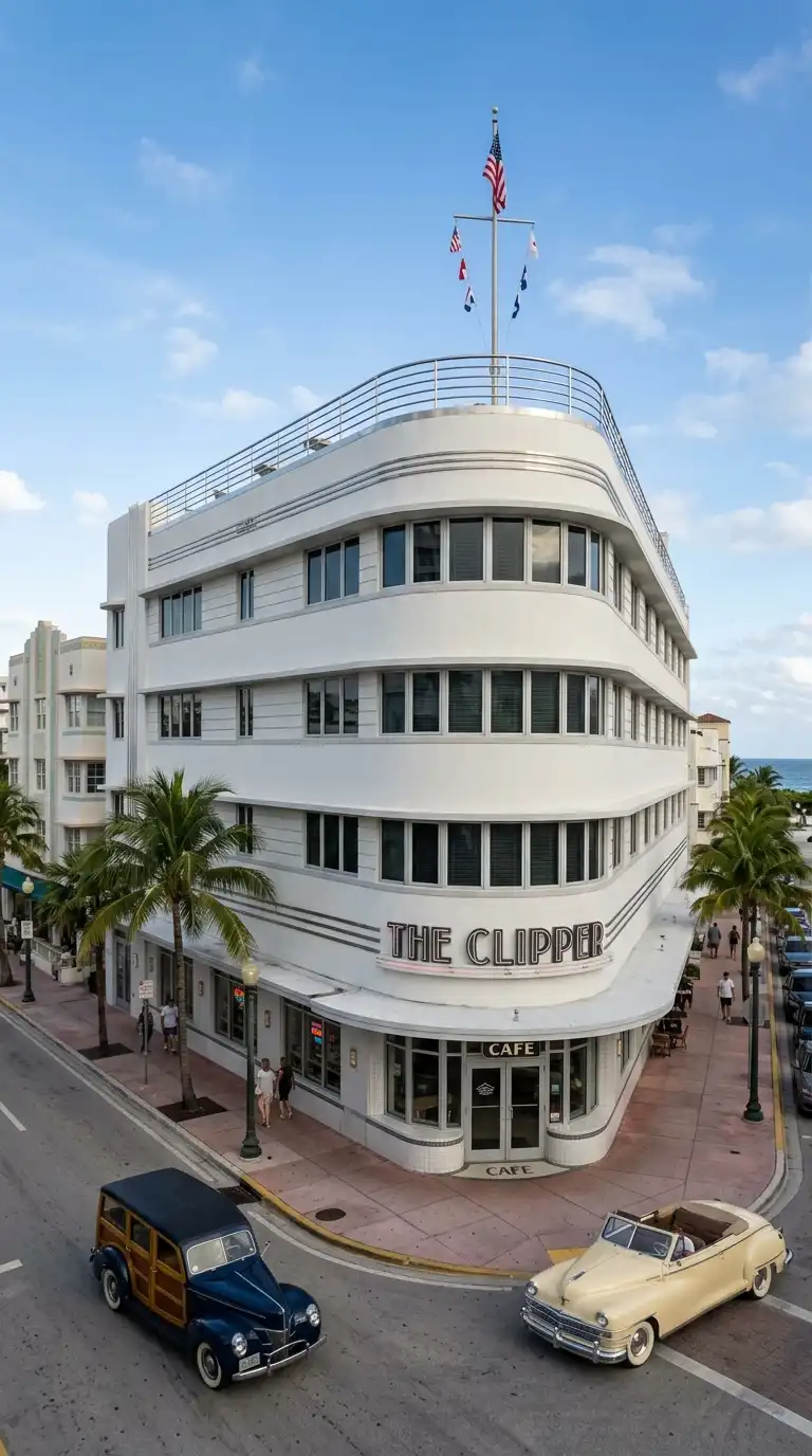
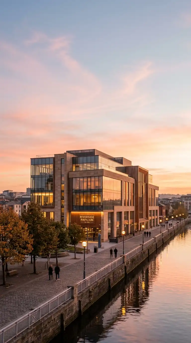
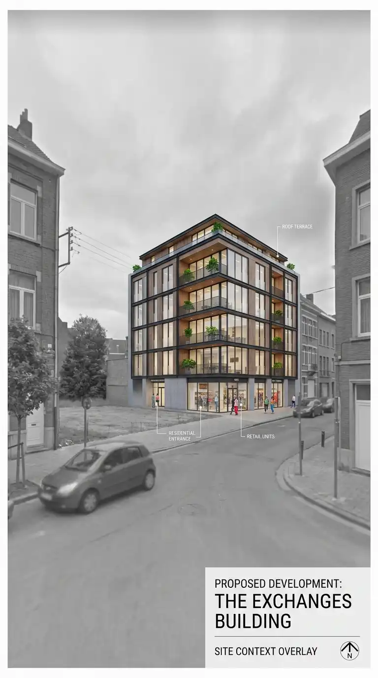
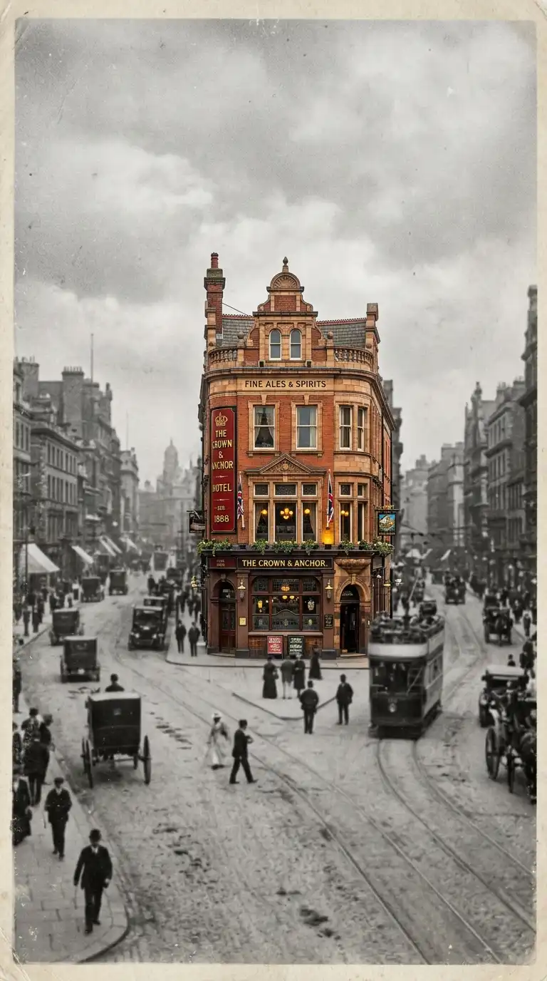
9. The Photographic Context Background
The photographic context background places the building in a photograph of its actual site. The photograph is faded, desaturated, or blurred so it does not compete with the building. The building is rendered or drawn over the photograph.
This background is ideal for site-specific presentations and contextual renderings. The emotional effect is contextual, realistic, and site-specific.
Quick Tips
- Desaturate or blur the photograph so it recedes.
- The building should be sharp and saturated.
- The photograph should be of the actual site.
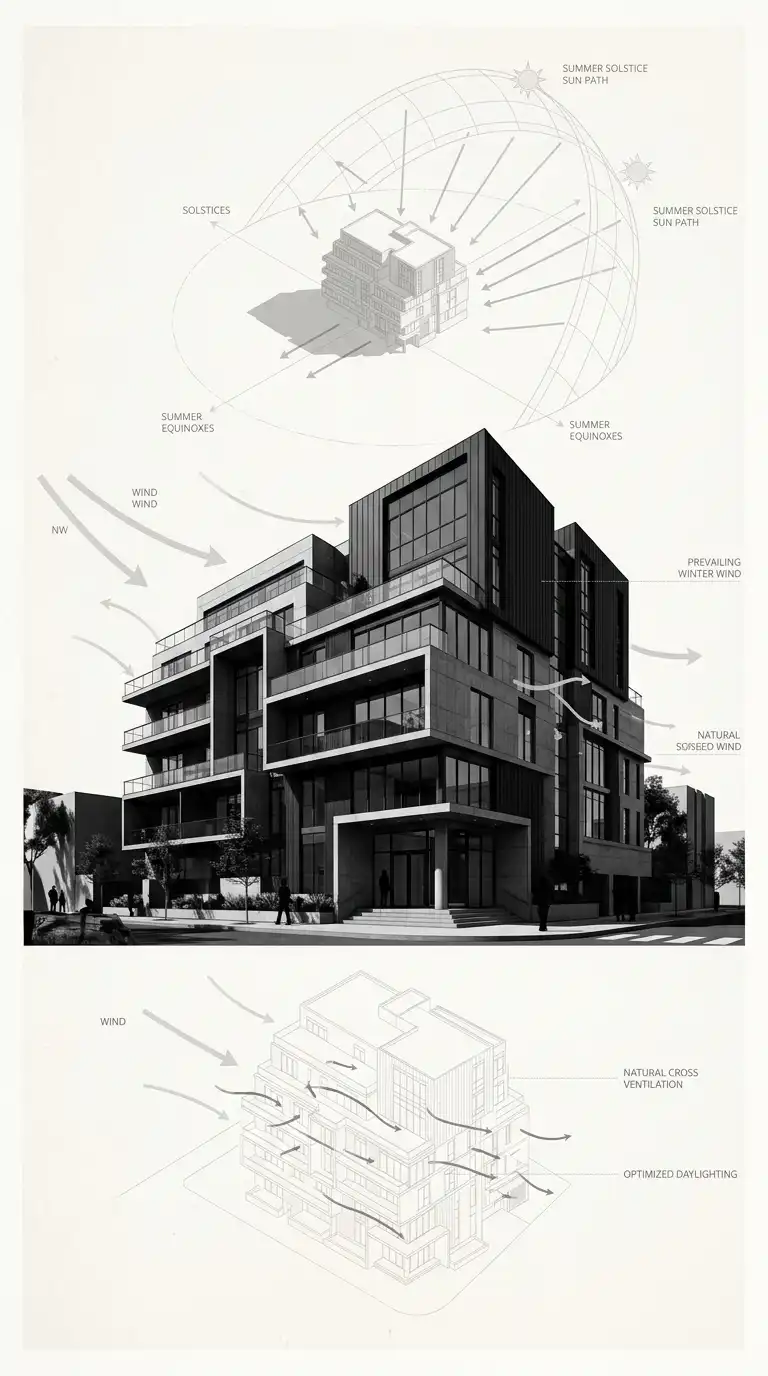
10. The Diagrammatic Background
The diagrammatic background uses abstract diagrams — sun paths, wind arrows, circulation lines — as the background for the building. The diagrams are light and faded. The building is dark and sharp. The background explains the building’s context.
This background is ideal for analytical presentations and concept boards. The emotional effect is analytical, layered, and informative.
Quick Tips
- Diagrams should be light grey or pale blue — not black.
- The building should be dark and sharp.
- The diagrams should be relevant to the building.
11. The Monochrome Photographic Background
The monochrome photographic background is a black and white photograph of a related building, site, or texture. The photograph is faded or blurred. The building is rendered in colour or sharp black and white. The background adds atmosphere without competing.
This background is ideal for conceptual presentations and mood boards. The emotional effect is atmospheric, layered, and photographic.
Quick Tips
- The photograph must be black and white.
- Desaturate or blur the photograph so it recedes.
- The building should be sharp and contrasting.
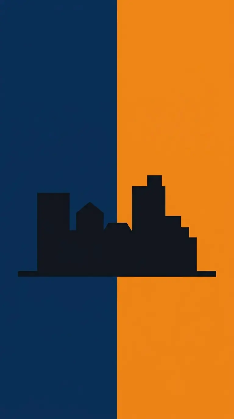
12. The Abstract Colour Field Background
The abstract colour field background uses large areas of flat colour. The colours are abstract — not representing sky or ground. The colour field is composed of two or three flat, bold colours. The building sits on the colour field.
This background is ideal for conceptual work, posters, and competitions. The emotional effect is bold, graphic, and abstract.
Quick Tips
- Use 2-3 bold, flat colours.
- No gradients, no textures, no shadows.
- The building should be black, white, or a single colour.
Final Thoughts
An architecture background is not a drawing. It is a setting. A white background is pure and neutral. A black background is dramatic and graphic. A paper texture is warm and tactile. A gradient sky is atmospheric and deep. The best backgrounds are not noticed — they are felt. They enhance the subject without competing. They set the stage, then get out of the way.
These 12 background ideas are not mutually exclusive. A gradient background can have a ground plane. A paper texture can be tinted. A photographic context can be monochrome. The best backgrounds choose the format that fits the subject, the audience, and the mood. They are not the star — but without them, the star has nowhere to stand.